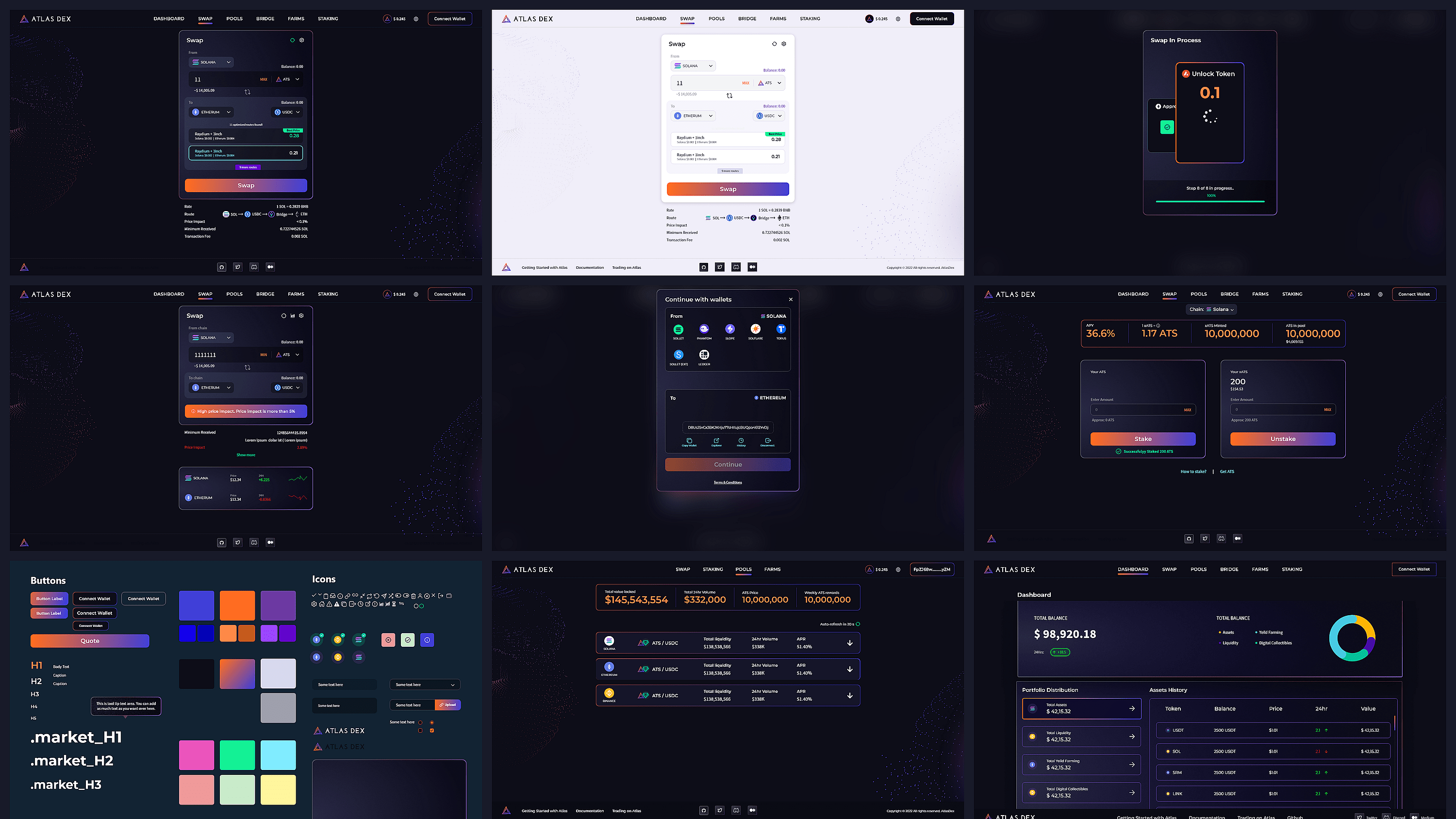
Decentralized Finance

Atlas DEX

Cross-chain DEX aggregator built on Solana

Designed the full product experience for Atlas DEX — from swap and bridge to pools, staking, farms, dashboard, and the design system. Delivered a credible interface that supported the platform's launch and helped the product raise $6M from Jump Capital and Huobi Ventures.

Role
Sole UI/UX Designer
Platform
Web application
Scope
Swap, Bridge, Pools, Staking, Farms, Dashboard
Tool
Adobe XD
Year
2022
Outcome
Product shipped live; $6M raised
Atlas DEX
Project
Atlas DEX
Focus
Trustworthy cross-chain flows
Users
Traders, liquidity providers, new DeFi users
Deliverables
UX, UI, Design System
01
Complexity
02
Simplification
03
Confidence
04
Adoption

What we learned before designing anything

Starting point
No time for a formal research phase
The client needed immediate design progress. Formal generative research wasn't part of the launch-phase mandate — so discovery had to move fast without cutting corners on understanding.
"The product was live in competitors' hands. Every week without a design was a week of lost positioning."
Inputs
Competitive audit, flow review, expert conversations
Discovery combined a competitive audit of existing DEX and bridge experiences, cross-chain flow review, wallet pattern inspection, and direct conversations with crypto experts. Product documentation and client feedback loops were central.
Core assumption
Trust and clarity outrank feature density
DeFi users have zero tolerance for ambiguity. Bad slippage warnings, confusing confirmations, and unclear wallet flows can cost real money. The assumption: clarity is the product.
Validated through design reviews and by checking against established DeFi interaction patterns throughout the proof-of-concept phase.
The challenge
Make cross-chain routing readable and reliable
The client had market research and a vision — but no product design. The platform needed to make complex routing across Solana, Ethereum, and BSC feel trustworthy, legible, and fast for all three user types.

Three audiences, three distinct paths through the product

Active DeFi Trader
Expert execution with full route visibility
Select tokens Input / output pair
Review route Chain + pool path
Check impact Slippage + price
Execute Confirm + track
Liquidity Provider
Clear yield decisions without data overload
View pools APY + TVL
Enter position Token deposit
Monitor yield Balance + rewards
Withdraw Claim + exit
New DeFi User
Actionable clarity, no DeFi prerequisites
Connect wallet Single step
Choose swap Simple inputs
Confirm Plain language
Track progress Step count visible

Three principles that governed every screen

01
System-first, screen-second
The design system was built before the screens. Button states, inputs, warnings, wallet selectors, and modal patterns were established first — so every screen that followed was consistent by default, not by revision.
02
Transparency earns trust
Showing the full routing path, price impact, and step-by-step progress adds visual complexity but removes doubt. In DeFi, doubt costs money. Every additional piece of information is a piece of confidence, not clutter.
03
Respect both audiences simultaneously
Expert traders need proof that aggregation logic is working. New users need a path that doesn't require reading a whitepaper. Good DeFi design makes the same information serve both — routes are readable for experts and ignorable for newcomers.

Five complexity problems. Five simplification decisions.

01 Routing transparency
Before — Complexity
After — Simplification
Users see only input and output tokens. The aggregation logic running underneath is invisible — which means there's no basis for trust and no way to verify the trade is optimal.
Every chain and pool step in the swap route is shown. Experts get proof the aggregator is working. New users can read only the result and ignore the path. Both are served by the same screen.
Tradeoff accepted: More visual complexity in the swap panel — justified because route transparency is the primary trust signal that differentiates an aggregator from a simple swap.
02 Price impact communication
Before — Complexity
After — Simplification
High-impact trades either go unwarned — or are blocked entirely. Neither works. Unwarned risks burn users; blocked trades send expert traders straight to competitors.
Warning banners surface the risk clearly and prominently, but don't block the action. Experienced traders who accept the risk proceed. New users get the information they need to reconsider.
Tradeoff accepted: Informing without blocking is a deliberate choice not to be paternalistic — preserving user agency while removing ignorance as a risk factor.
03 Cross-chain progress feedback
Before — Complexity
After — Simplification
A loading spinner with no context. Cross-chain transactions take 30–90 seconds. Without feedback, users assume the transaction failed and retry — creating duplicate submissions and lost funds.
Explicit step counts with chain labels show exactly where the transaction is in the process. Users know whether to wait, whether something failed, and what comes next — without needing to understand the protocol.
Tradeoff accepted: More engineering work to surface step state — justified because clear progress is the most important communication the interface can provide during confirmation.
04 Multi-wallet bridge flow
Before — Complexity
After — Simplification
The requirement for a destination chain wallet is discovered mid-transaction. Users have already committed intent and are then interrupted by an unexpected requirement — one of the highest-friction moments in DeFi UX.
Source and destination wallets are displayed together at the start of the bridge flow, making the two-wallet requirement explicit before any action is taken. No hidden prerequisites surface mid-transaction.
Tradeoff accepted: The bridge entry screen has more elements than a simple swap — but the alternative is worse: users who discover the second wallet requirement mid-flow abandon the transaction at high rates.
05 Staking and pool clarity
Before — Complexity
After — Simplification
Liquidity provider screens expose raw protocol data — contract addresses, epoch counters, technical parameters — alongside the metrics providers actually use to make decisions. The signal is buried in noise.
Staking surfaces only APY, current balance, and pending rewards. Pools surface APY, TVL, and position status. Everything else is removed. The decisions providers need to make drive the information hierarchy.
Tradeoff accepted: Technical data is deprioritized in favor of decision-relevant data — acknowledging that liquidity providers don't need more controls, they need more clarity on the metrics that actually matter.

Three workflows made trustworthy

Swap + Bridge
Cross-chain swaps
Users swap across Solana, Ethereum, and BSC with route transparency and trusted confirmations. Step-based progress eliminates the fear of lost transactions during the 30–90 second cross-chain window.
Bridge
Bridge flows
Clear bridge paths and upfront wallet context reduce the risk of chain mismatches and unknown errors. The dual-wallet display removes the most common mid-flow abandonment point in cross-chain UX.
Pools + Staking
Liquidity and staking
Providers manage pools and stake ATS tokens with concise yield and reward information. The simplified view removes technical noise and surfaces only the numbers that drive provider decisions.

What this project taught about designing for DeFi

01
What worked
System-first design compresses consistency cost to zero
Designing the component library before the screens meant consistency was structural, not a review step. Routing panels, wallet selectors, and risk banners all followed the same component logic from day one. That foundation is what made the full DEX experience feel coherent across six distinct product surfaces.
02
Productive tension
The expert-novice split is a real design constraint
Designing for a cross-chain aggregator means navigating two audiences with opposite needs on the same screen. Traders need the route. New users need the result. The solution was information that layers — visible to experts, ignorable by newcomers — rather than two separate UIs. That approach held, but it requires constant calibration of what's shown by default.
03
Next iteration
The bridge flow deserves user validation before scaling
The dual-wallet bridge design solves a known drop-off problem — but it was built on expert assumptions, not observed behaviour. The next iteration would validate that flow with real users and use the dashboard to surface actionable portfolio insights that go beyond balance and reward status.

Product shipped

Launched the initial DEX experience ahead of the funding milestone.

$6M raised

The design supported the product's raise from Jump Capital and Huobi Ventures.

Design confidence

Created a trusted cross-chain flow model for traders and liquidity providers.

System foundation

Established reusable UI patterns across swaps, bridges, staking, and dashboard screens.

Interested in product design for complex financial systems?