APIMatic is a Developer Experience platform focused on enhancing productivity through automatic code generation and a comprehensive suite of tools like SDKs, API portals, and documentation. As the lead for product design, I am dedicated to refining the product and eliminating friction for a seamless user experience.
- MY ROLE
- User Research
- User Flows & Mind Mapping
- Journey Mapping
- Wireframing
- Interaction Design
- Screen Flows
- Visual Design
- HTML/CSS | SEO Optimization
- PLATFORMS
- Web (Cloud based)
- More Details
- Official Website
Problem
How can we enhance the overall API lifecycle management experience by providing a seamless, integrated platform that improves efficiency, user satisfaction, and actionable insights?
Overview
APIMatic aims to streamline and enhance the API lifecycle management process for developers and organizations. By offering a comprehensive platform that includes a dashboard, developer experience portal, API CoPilot (AI) and analytics product, we strive to address the critical needs of our users.
- User's feedback
- We collected user feedback directly through interactions with the customer success team, enabling us to extract valuable insights from our users.
- Insight tools
- We employed various tools such as MixPanel, Google Analytics, and Clarity to gain a comprehensive understanding of user pain points.
- Competitive analysis
- A thorough analysis of competitors' approaches to handling specific use cases and potential enhancements.
- Journey mapping
- This approach provided valuable insights into the user flow, aiding our understanding of user behavior.
Learning About Our Users: Key Findings and Results
The user experience of our users is our top priority because any disruptions in their experience can lead to frustration. To understand their pain points, I delve into insights and metrics using various tools.

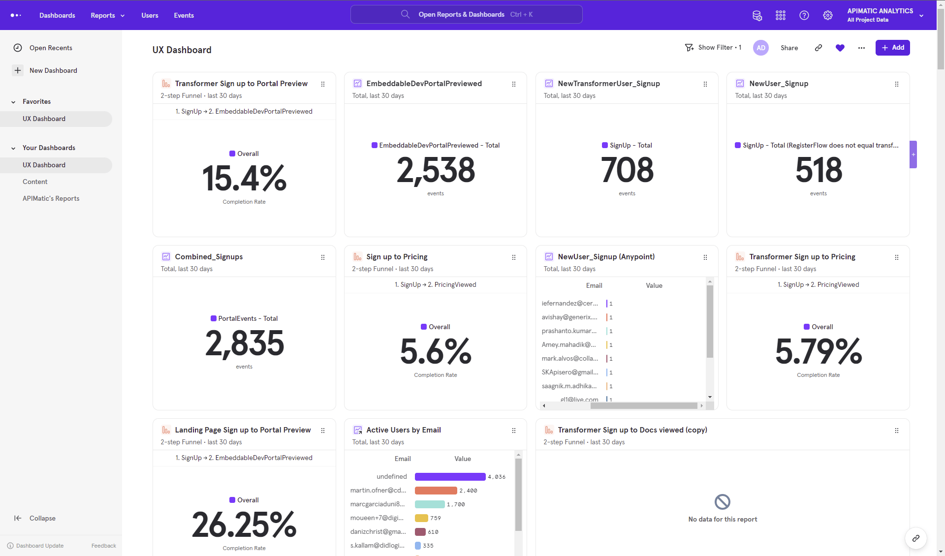
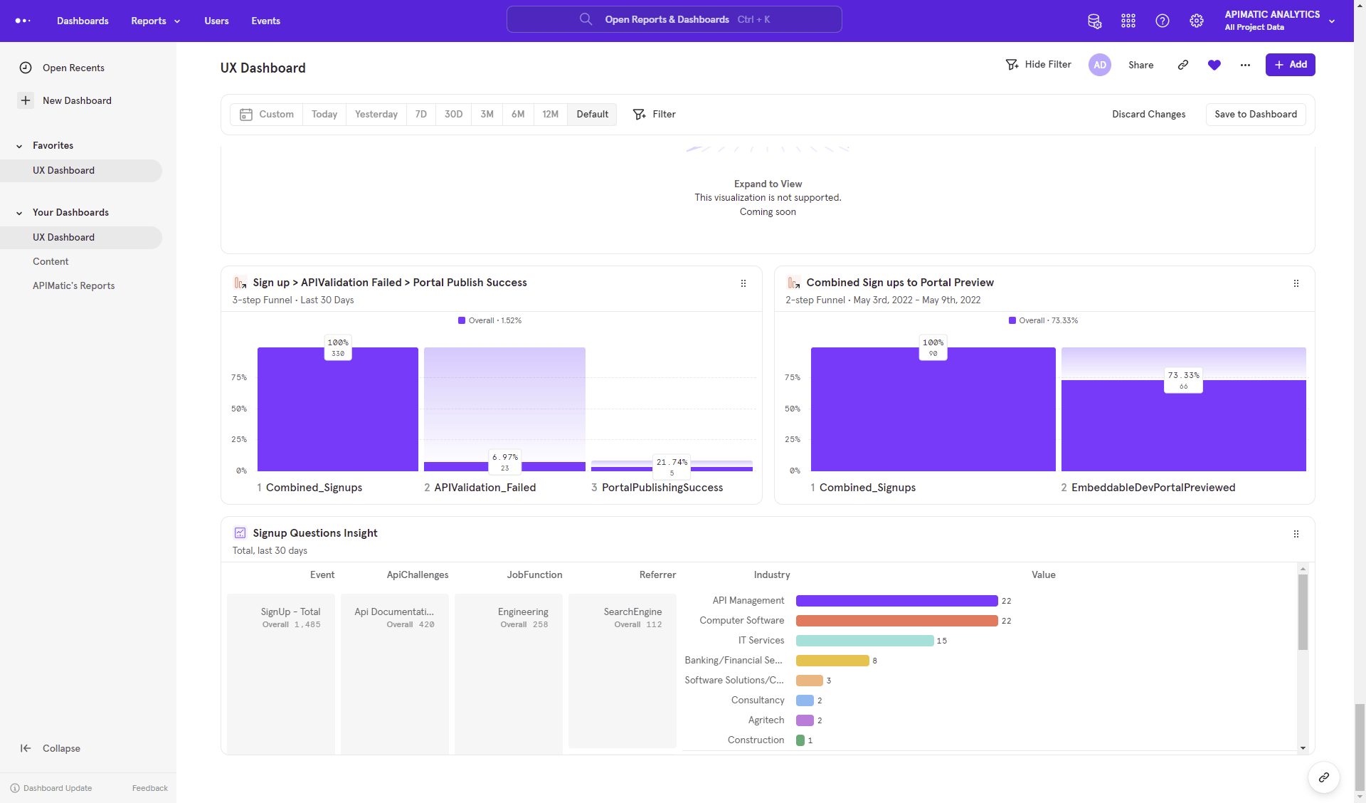
MixPanel Tool
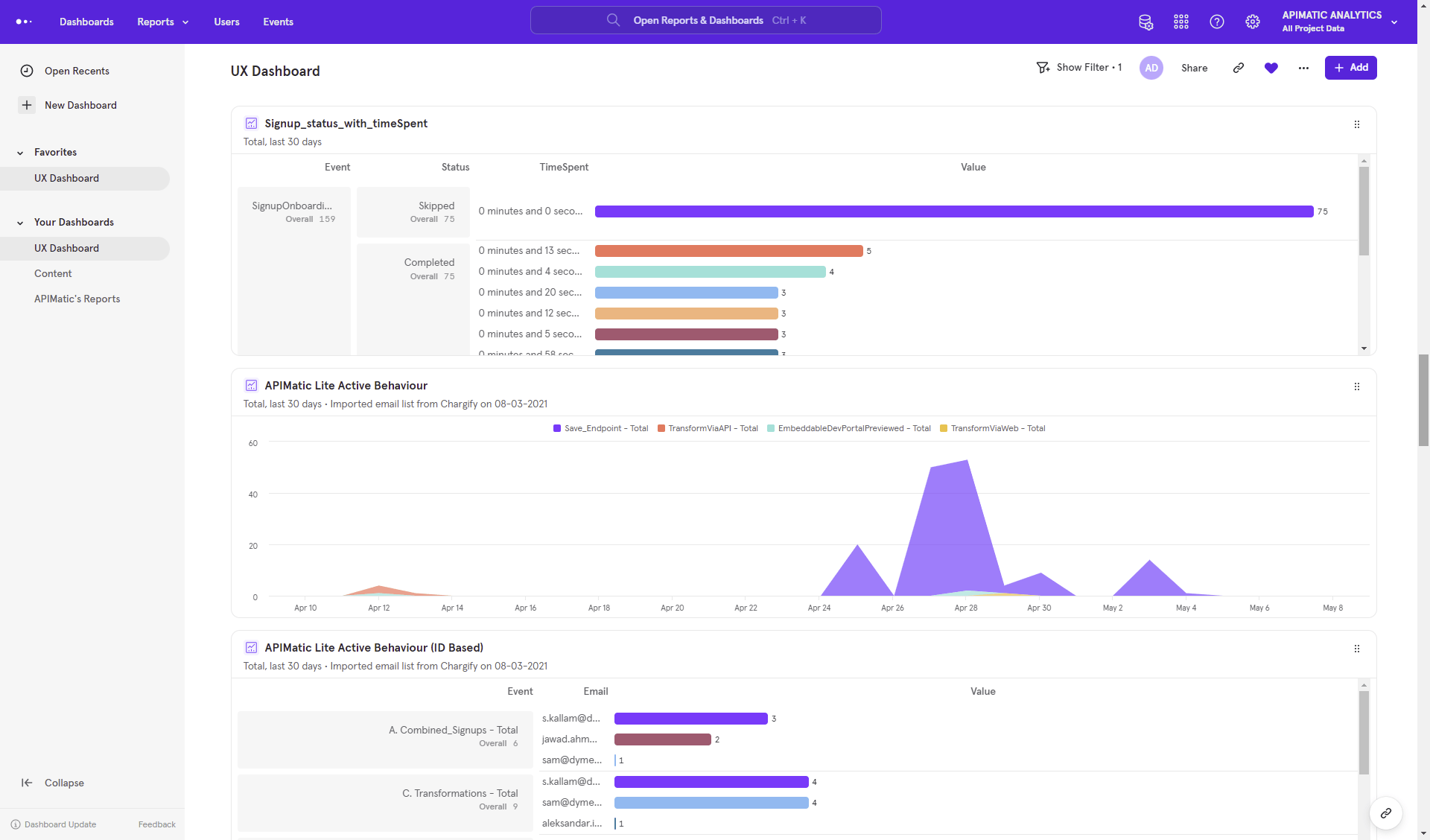
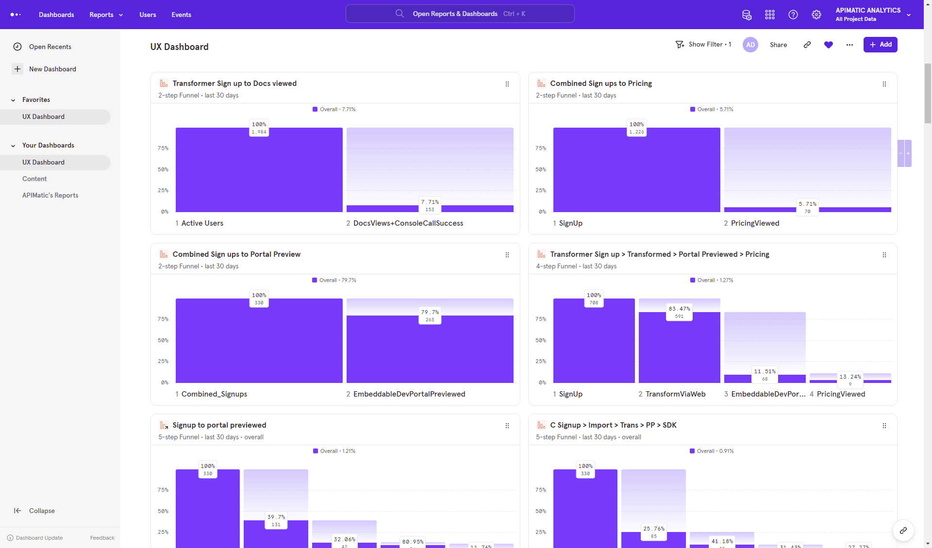
I created new funnels and cohorts in my UX Dashboard of Mixpanel as some key filters were missing, causing us to lose many users whose UX we needed to fix. Using Mixpanel, I extracted user flows and usage patterns through these funnels and cohorts. This approach allowed for tailored extraction based on the user's flow and specific use case. The data provided valuable insights, helping our team understand core issues and identify opportunities across different stages.

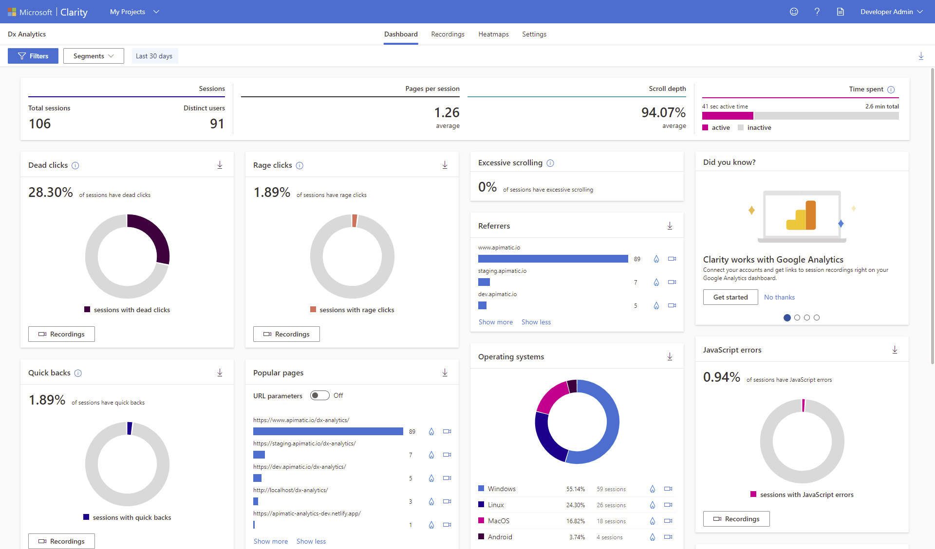
Microsoft Clarity Tool
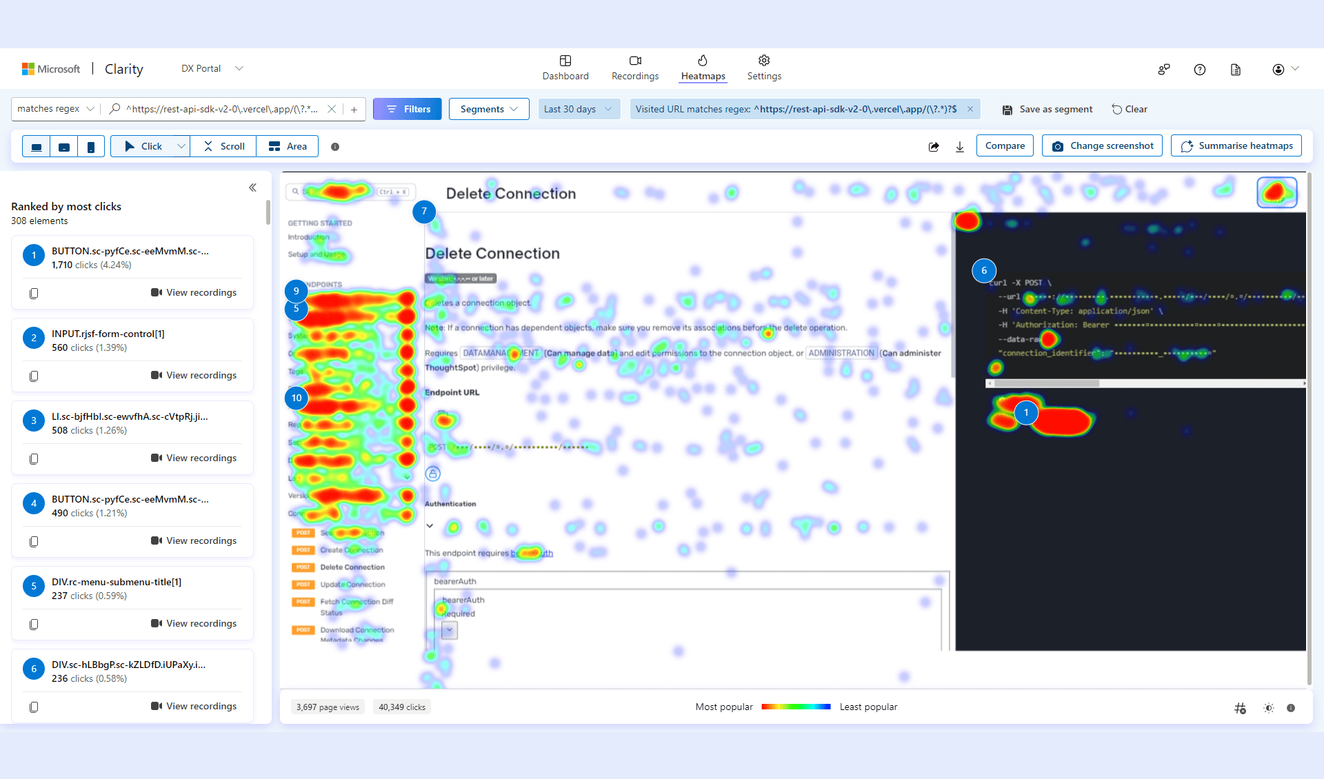
To conduct further testing on specific options, I utilized Microsoft's Clarity tool. I created new funnels and cohorts in Mixpanel to address missing key filters that were causing us to lose users whose UX needed improvement. I also added smart filters and funnels to capture all user use cases and further enhance UX. The Clarity platform provided a deeper understanding of user behavior, pinpointing pain points and preferences. Its array of tools, including session replays and heatmaps, helped us identify areas of user friction and engagement. Additionally, it supported our efforts in leveraging user research and A/B experimentation.
Mind Map & User Flows
In the initial stages, I utilized a mind map to brainstorm and organize ideas, features, and functionalities, providing a clear, visual structure for the product's scope. Subsequently, I developed user flows to detail the sequential steps users take to accomplish specific tasks within the platform. This method ensured a user-centered design approach, mapping out the user journey and interactions effectively.
Journey Mapping
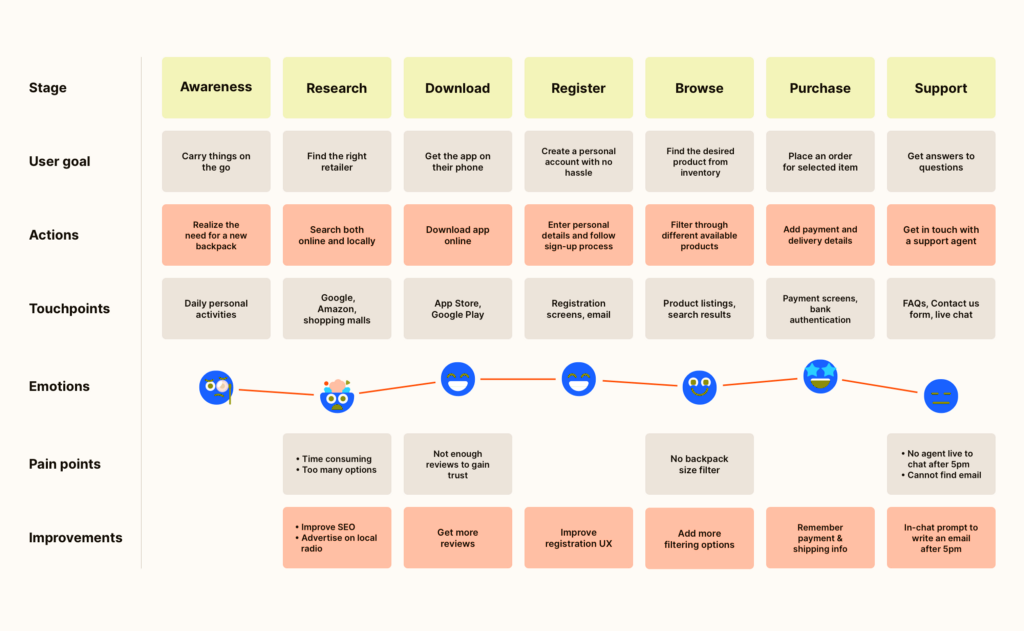
Drawing from in-person feedback, surveys, and reviews, I organized the data into a journey map. This process enabled me to pinpoint pain points and areas for improvement across the journey. Furthermore, it facilitated discussions aimed at understanding knowledge gaps and generating ideas among team members and stakeholders.
Design System
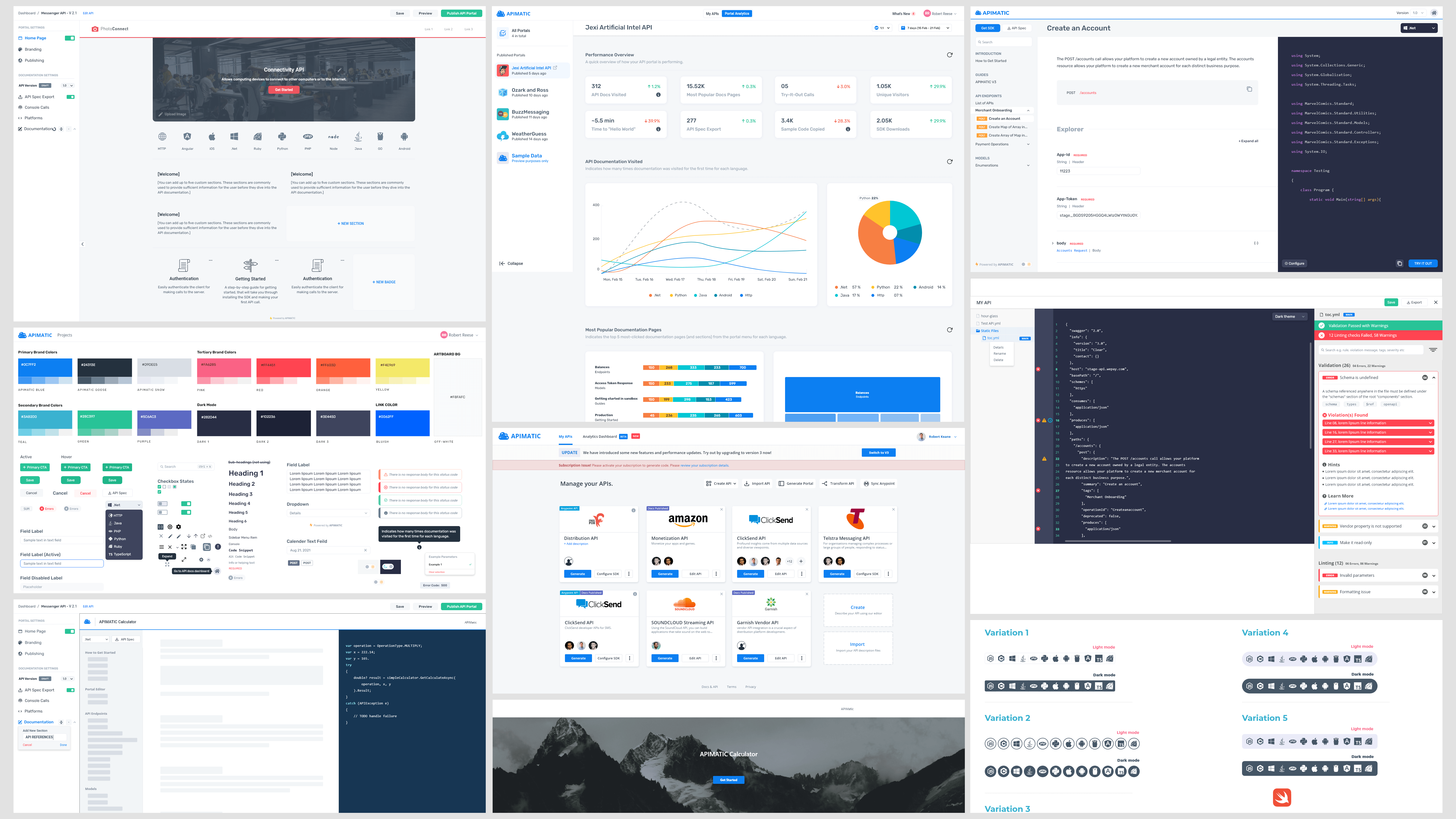
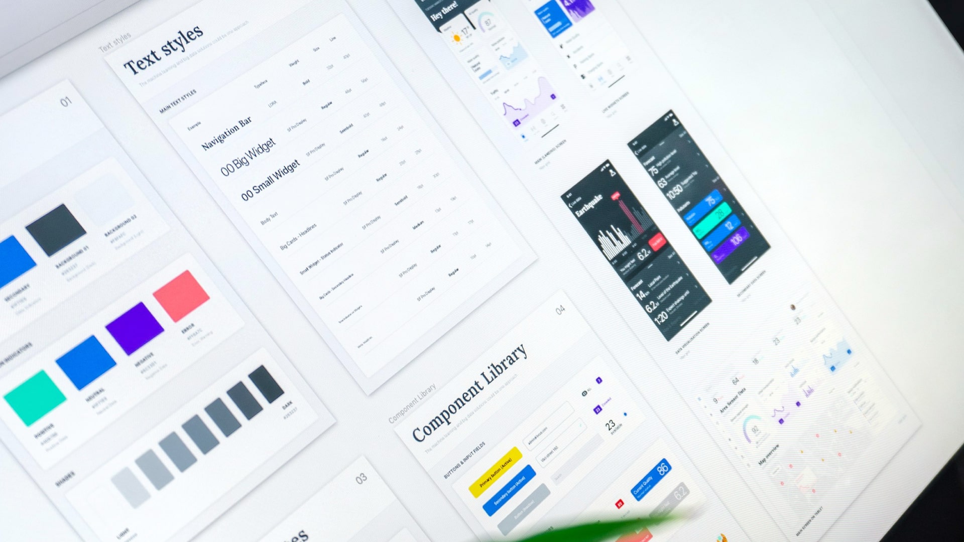
To establish a single source of truth, we developed and managed a comprehensive design system. This system enables teams to design, collaborate, implement, and enhance the product seamlessly. Starting with a foundational design system, we continuously evolve and update it over time, including the addition of dark mode theme tokens, to ensure its relevance and effectiveness across all user interfaces.
DX Analytics
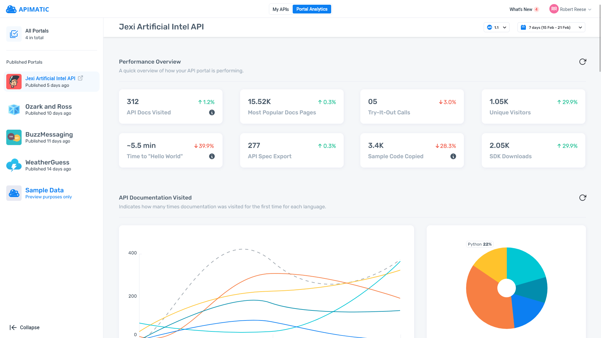
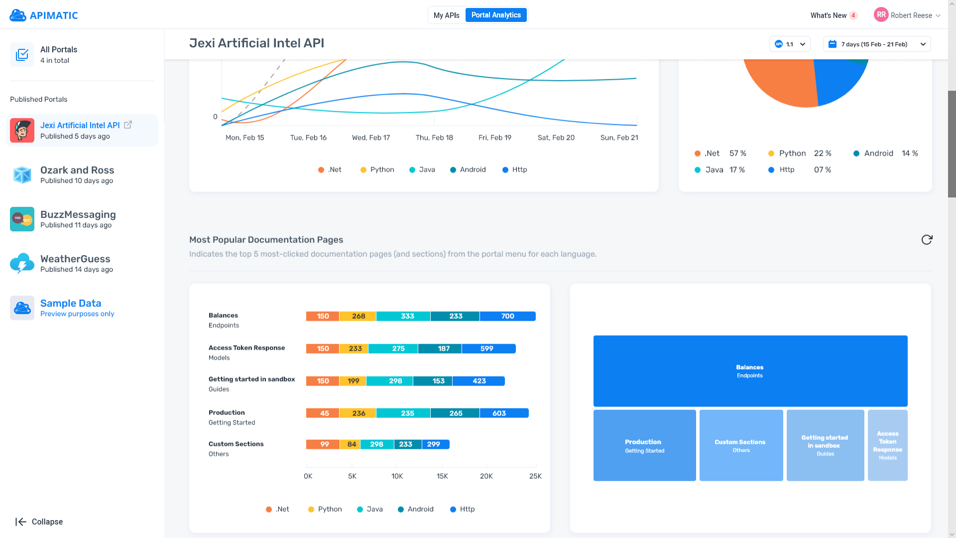
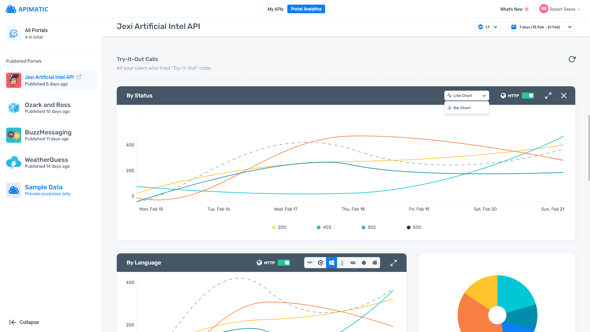
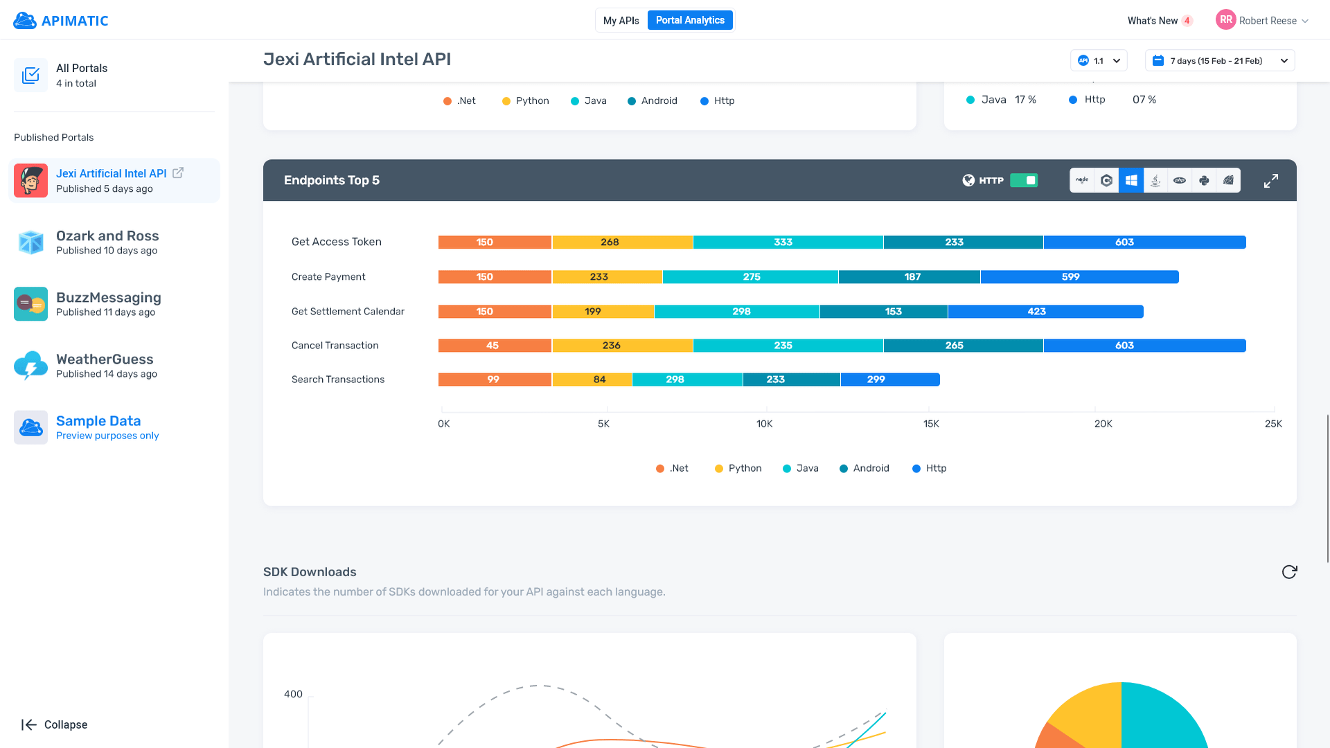
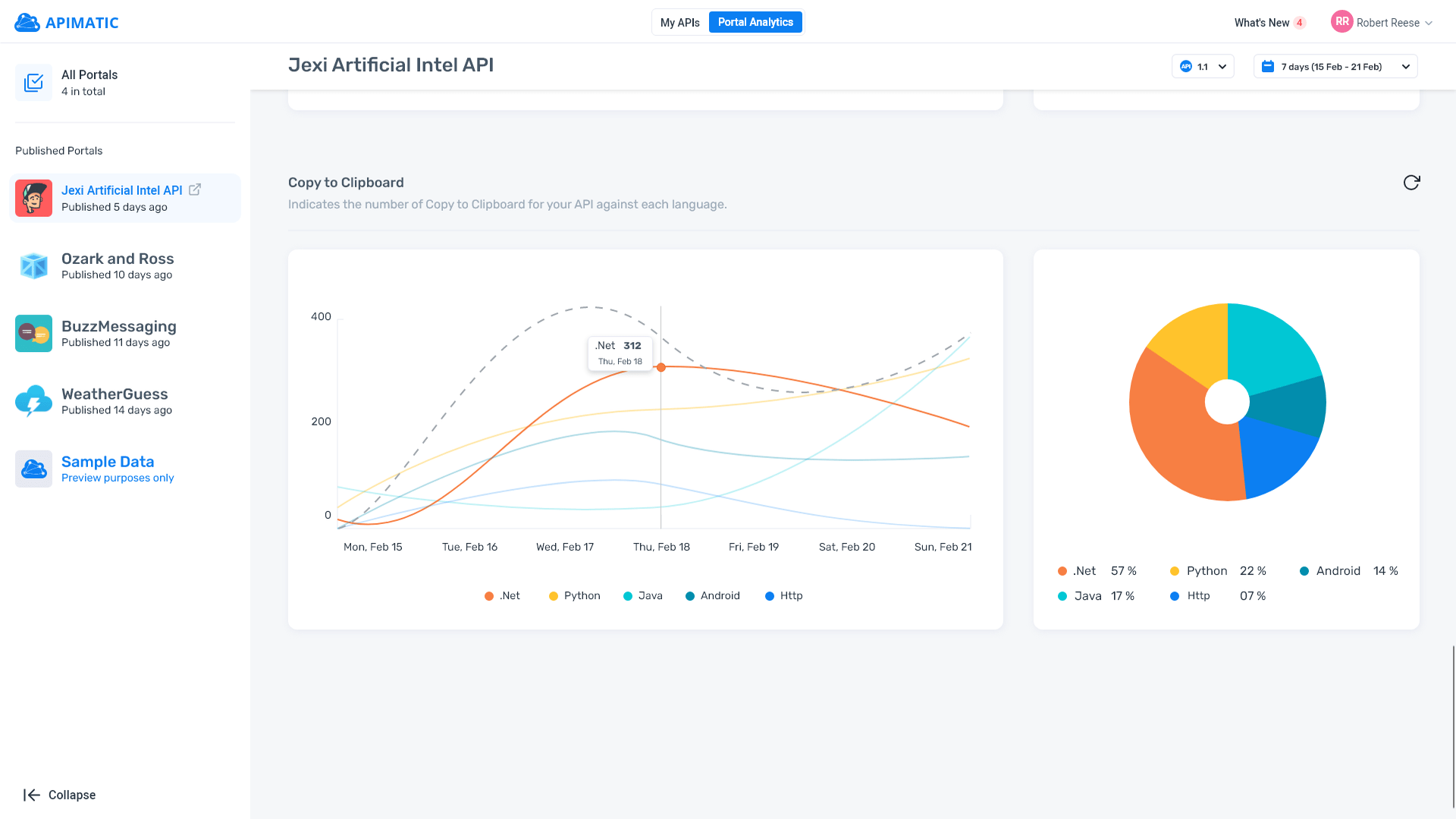
DX Analytics stands as a distinctive tool crafted in-house by our engineering and design teams. It empowers users to analyze the performance of their API documentation via the DX Analytics dashboard, offering key metrics such as API Portal page visits, SDK downloads, time to first "Hello World," and more. Leveraging user research, we meticulously implemented all necessary insights to enhance the user experience.
Email Journeys
When users sign up on the APIMatic website, they're prompted to go through a quick walkthrough. However, many users tend to skip this step to quickly dive into the product. To address this, our design and content teams collaborated to develop various email journeys. These journeys deliver customized emails tailored to users' usage patterns and flows, allowing them to learn more about the product at their own pace. Leveraging Autopilot journeys, we meticulously crafted user flows with personalized guides and featured emails to enhance user engagement and understanding.
Project Titan 1.1 (Docs Editor)
Numerous enhancements were made to the product, with a significant focus on the Docs Editor. I invested over 100 hours sketching various ideas and collaborating with my team on brainstorming sessions. Together, we developed low-fidelity wireframes and prototypes to test with both users and internal teams. Our efforts encompassed a range of features aimed at enhancing existing flows and improving user experience across the board.
DX Portal (v3)
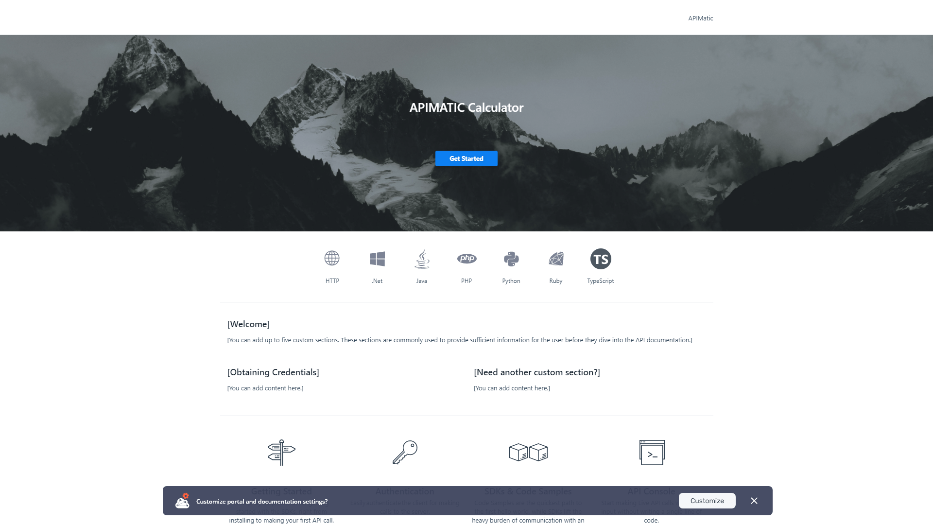
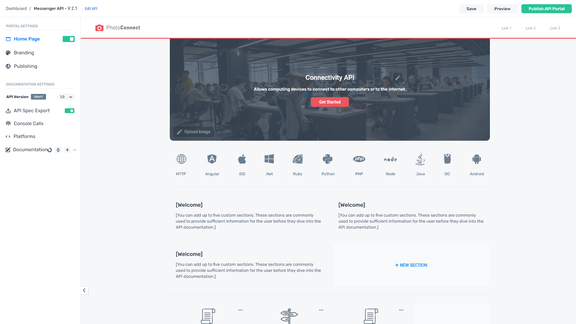
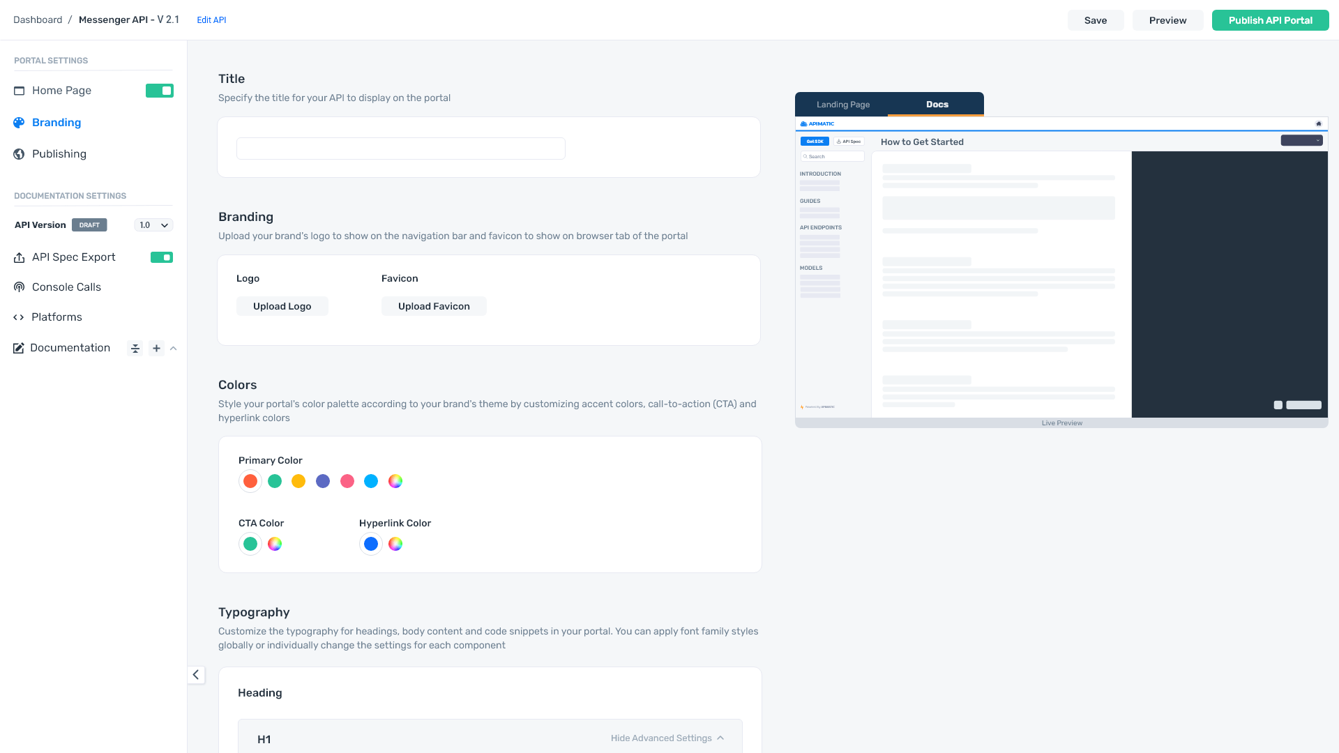
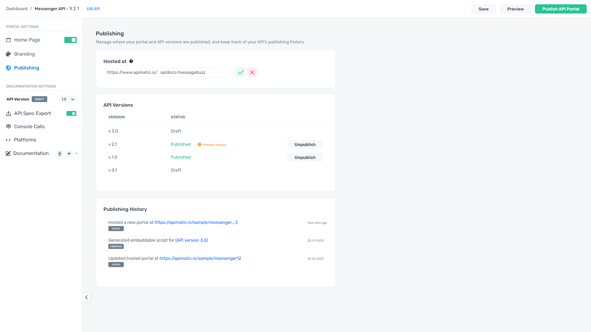
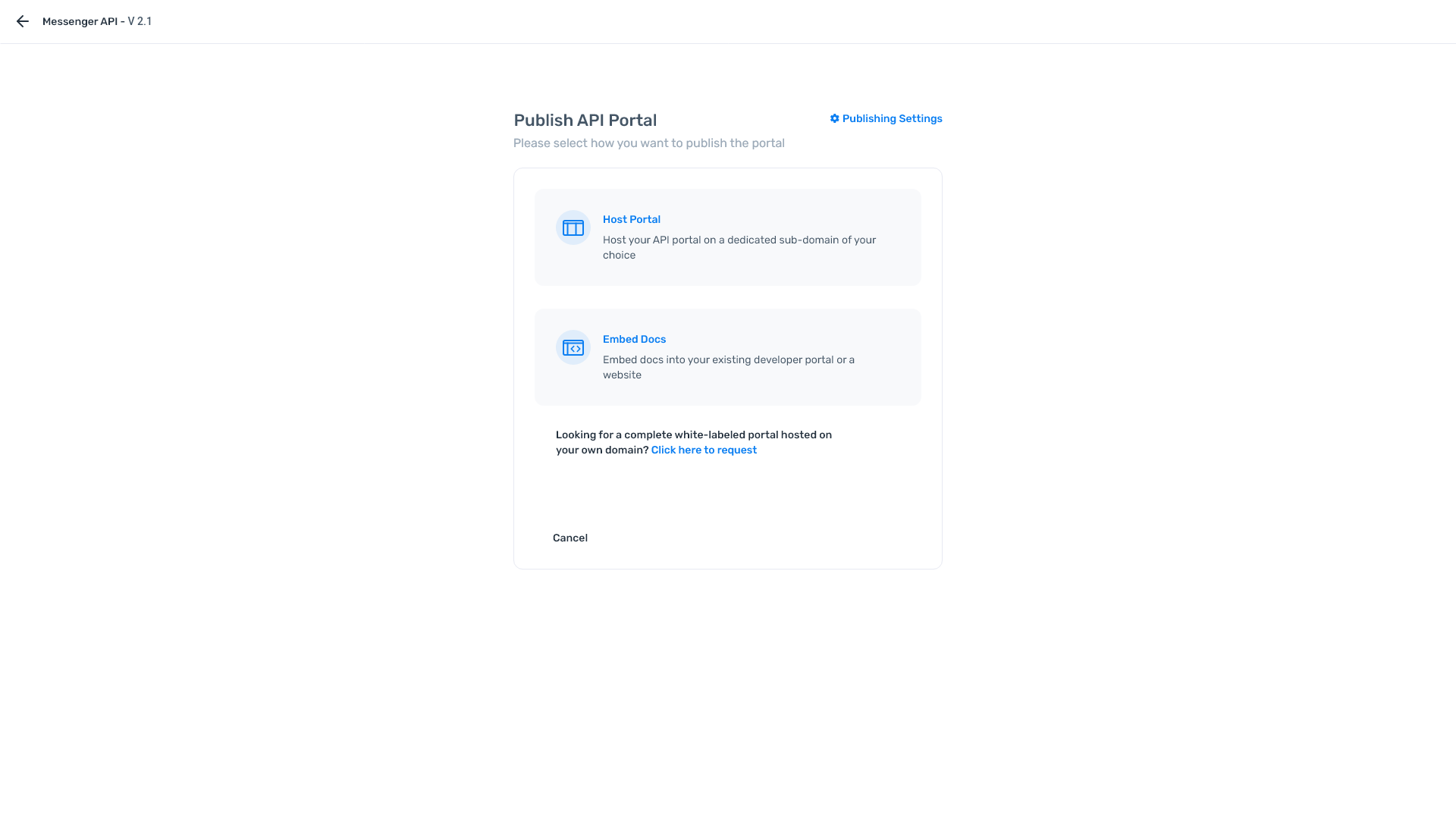
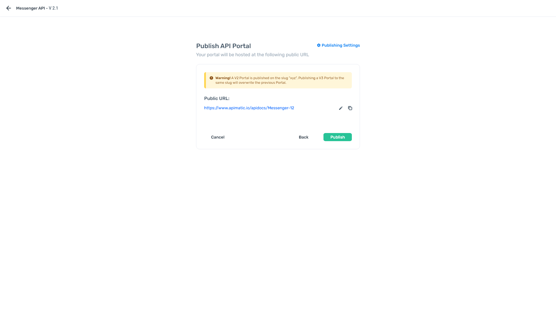
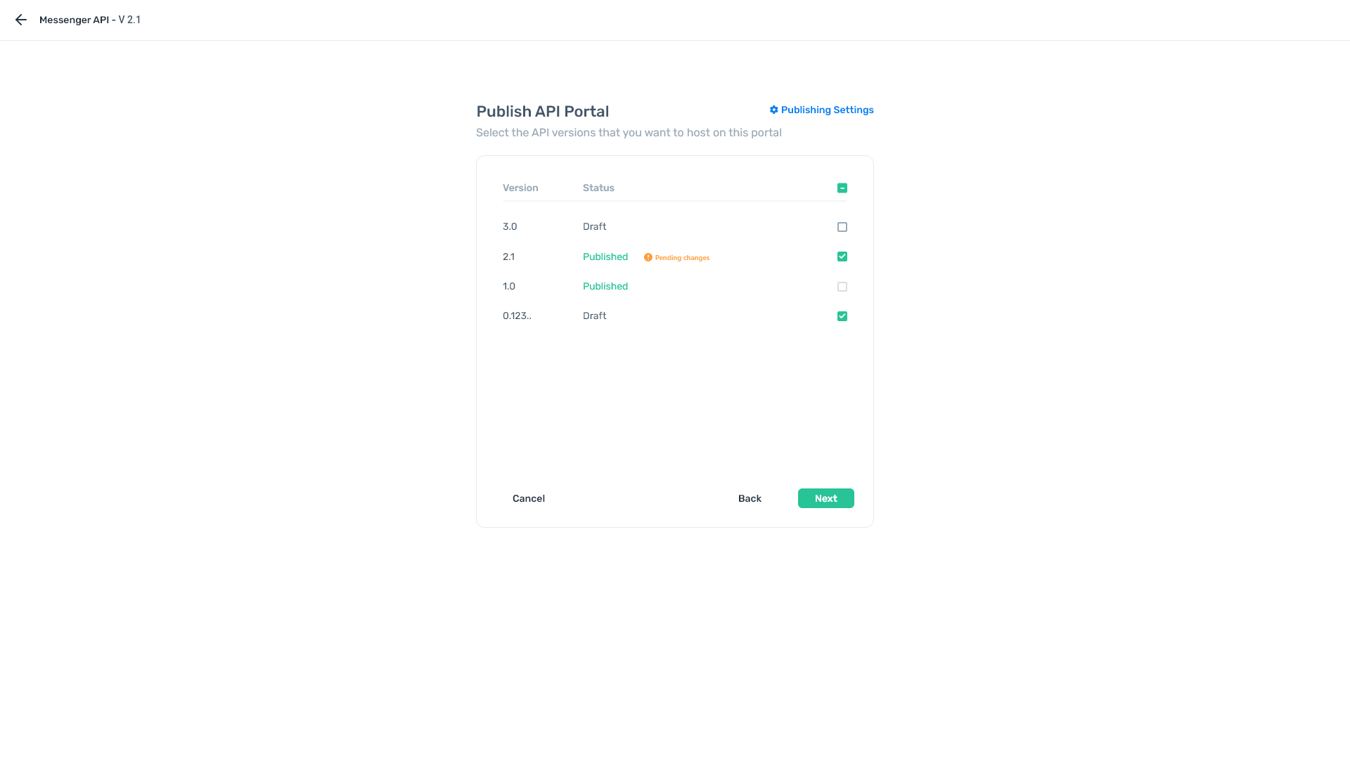
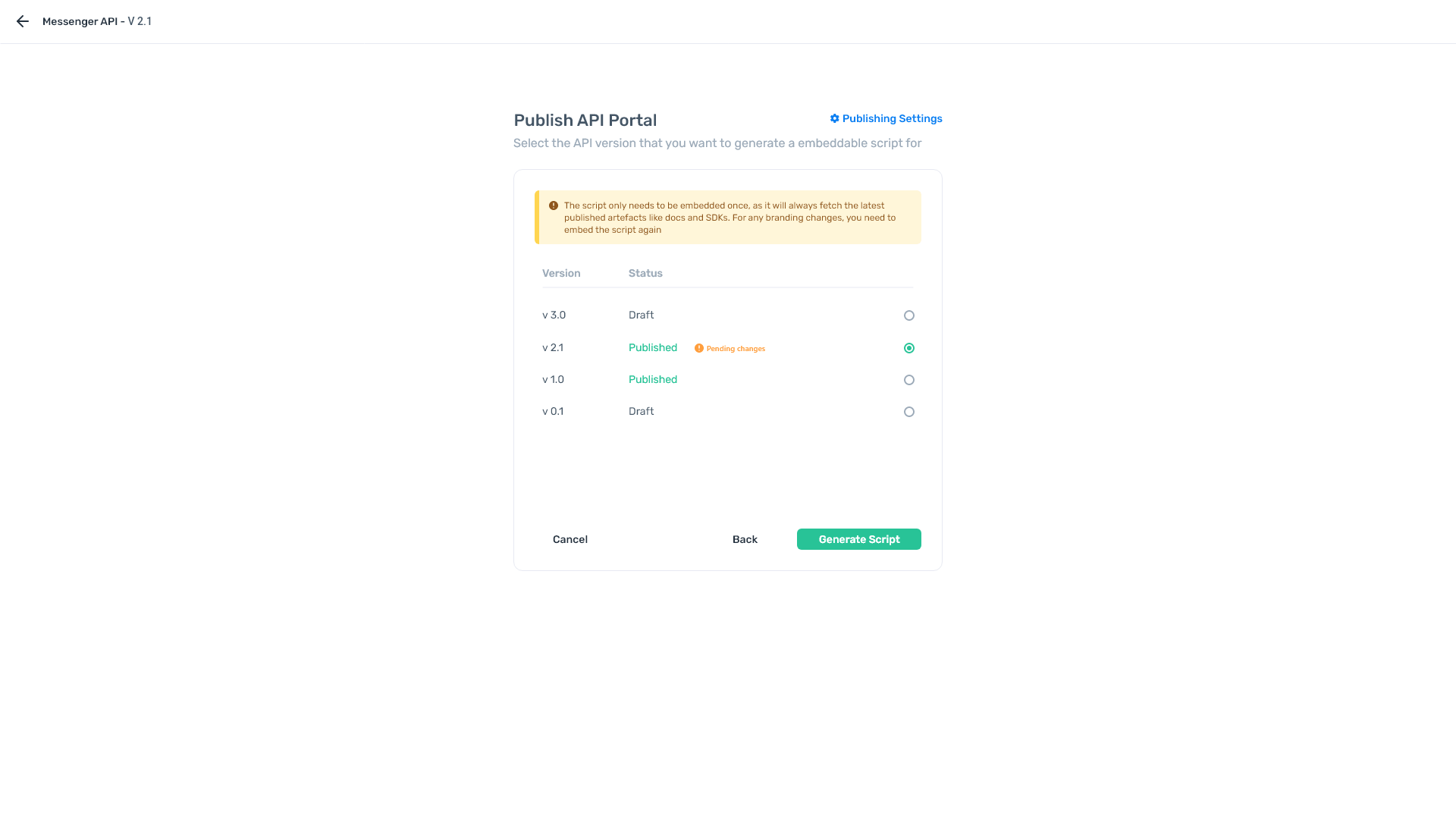
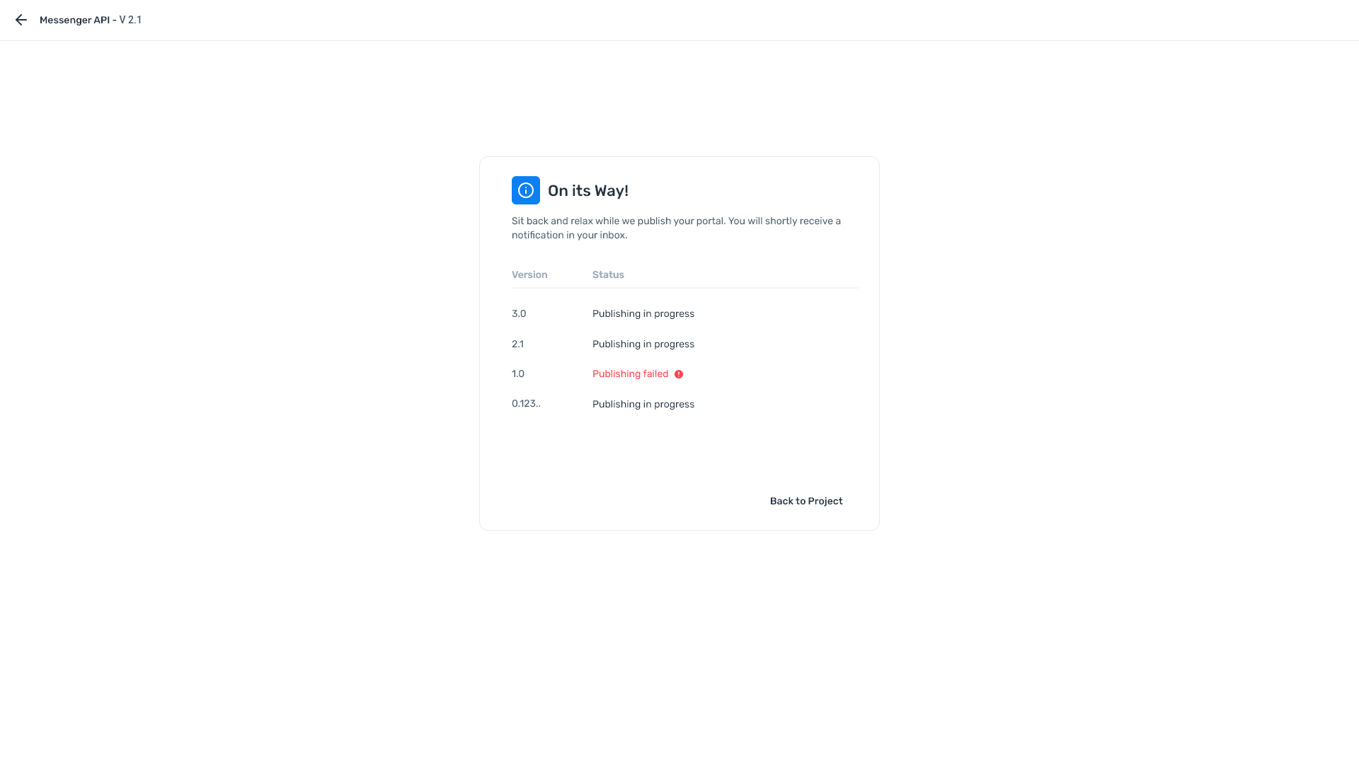
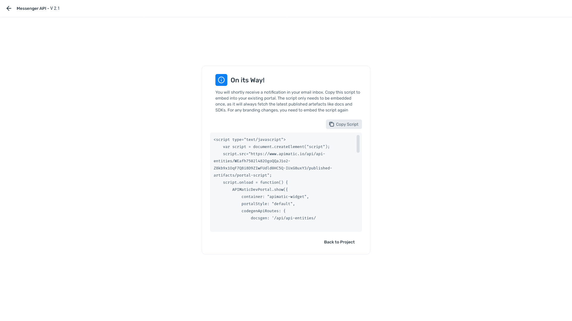
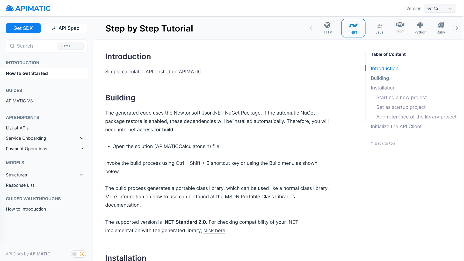
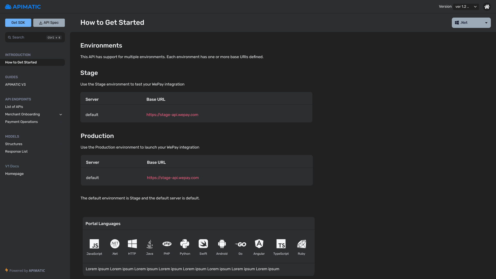
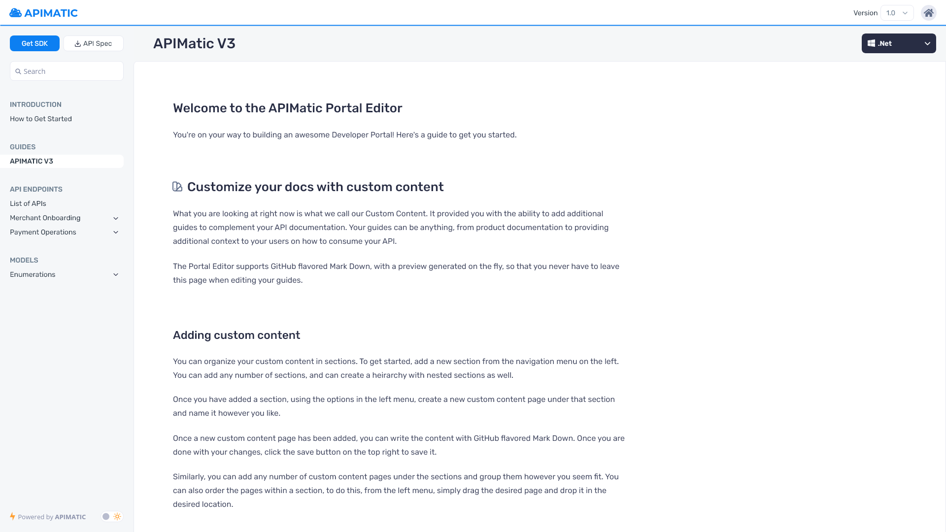
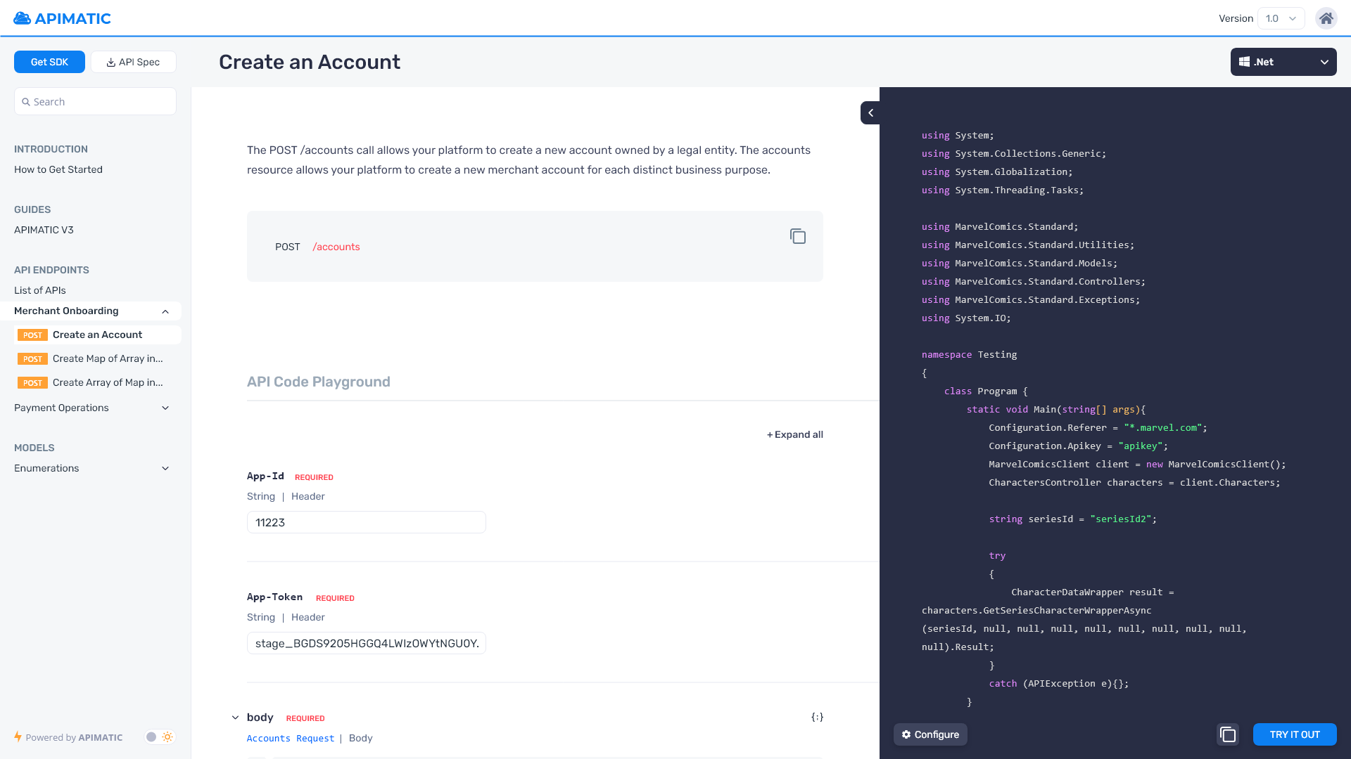
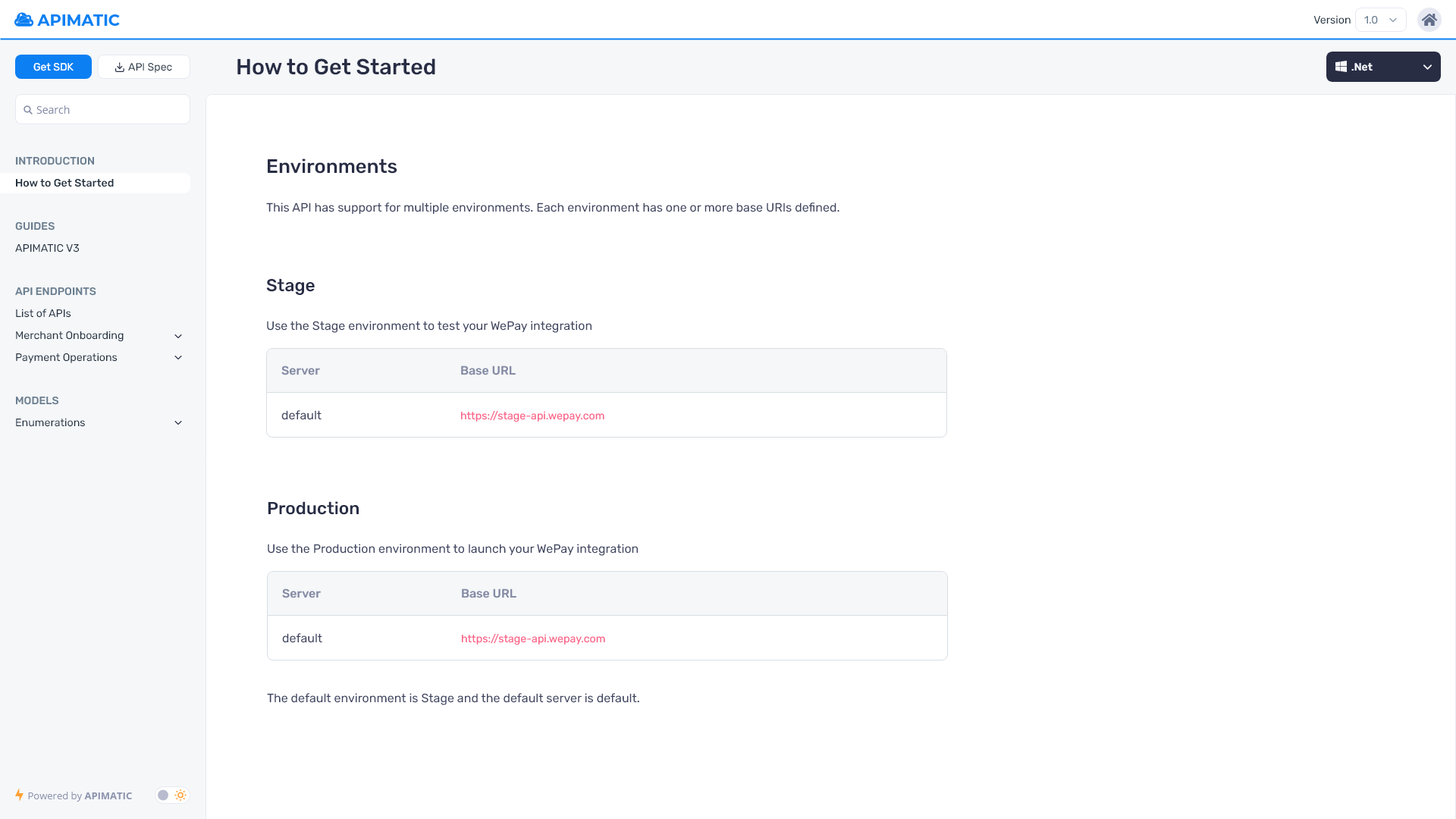
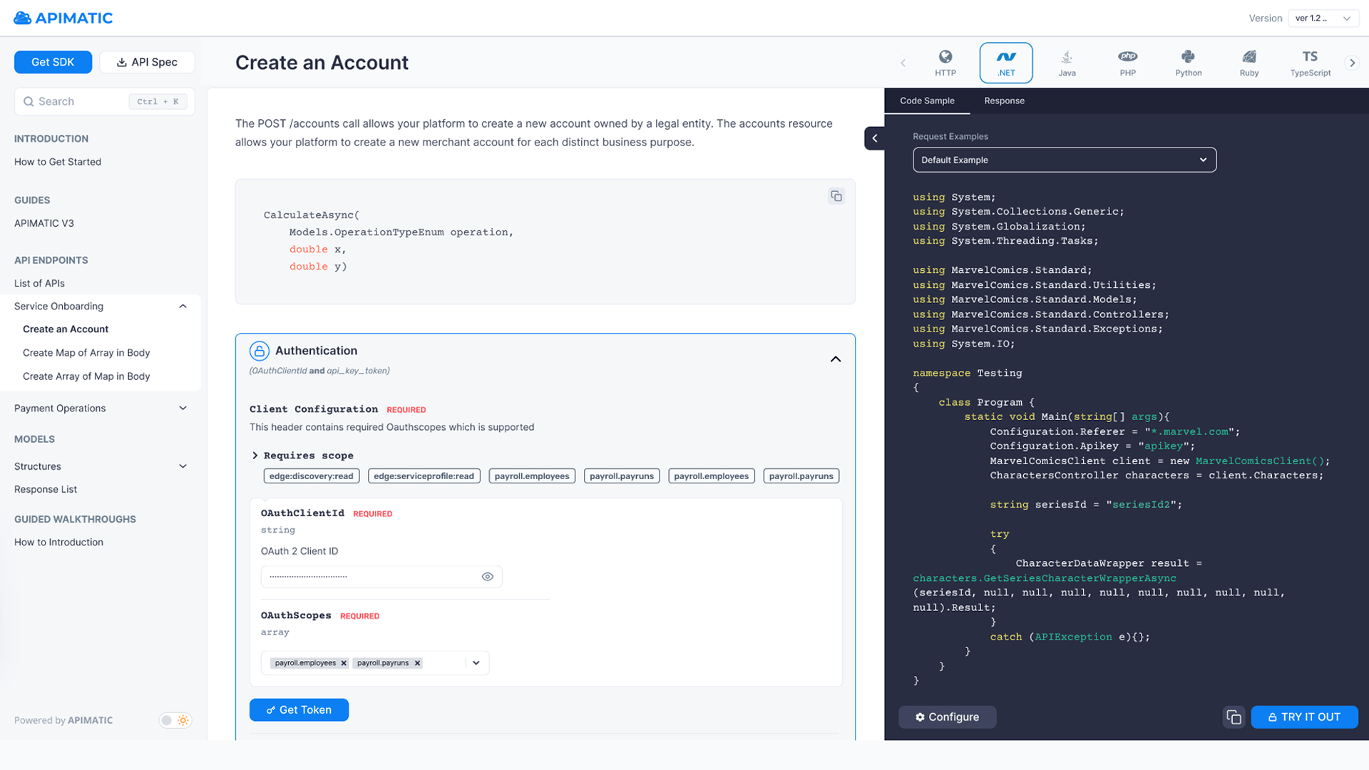
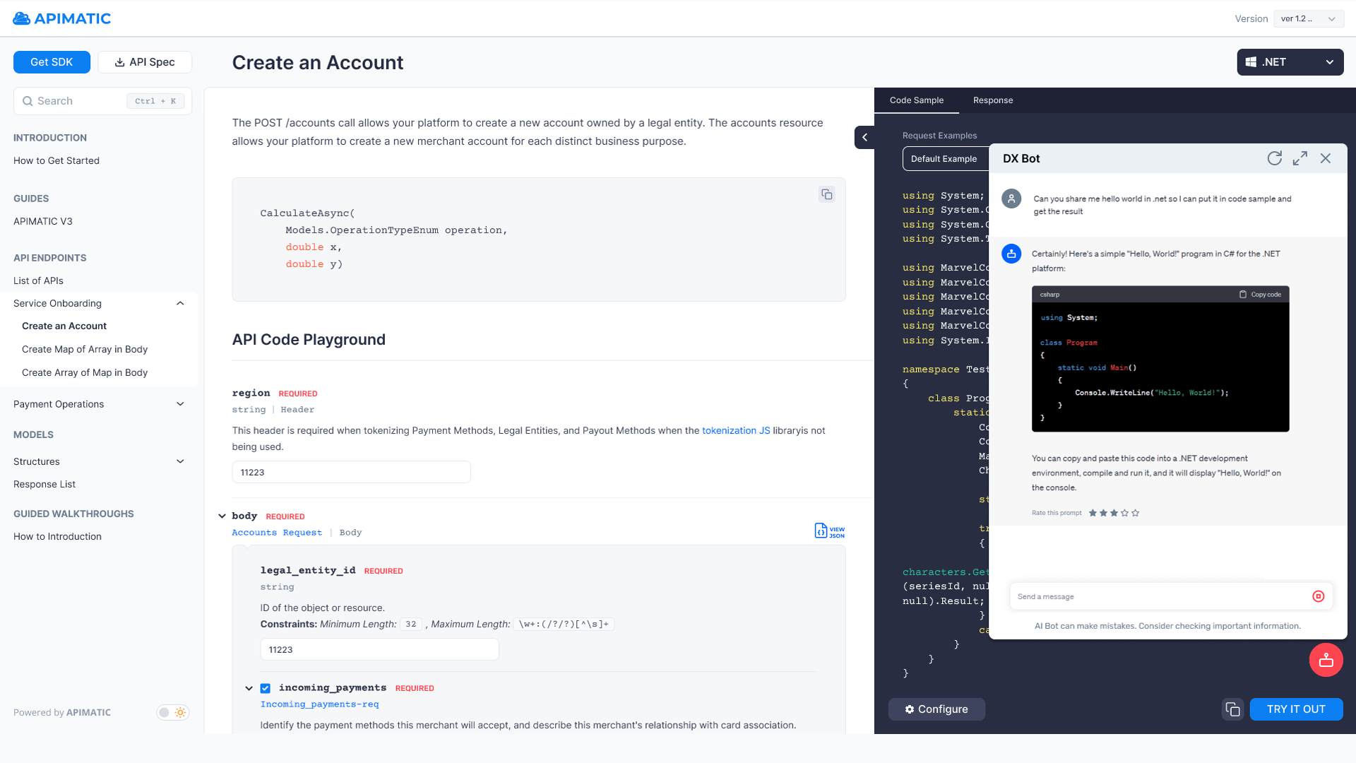
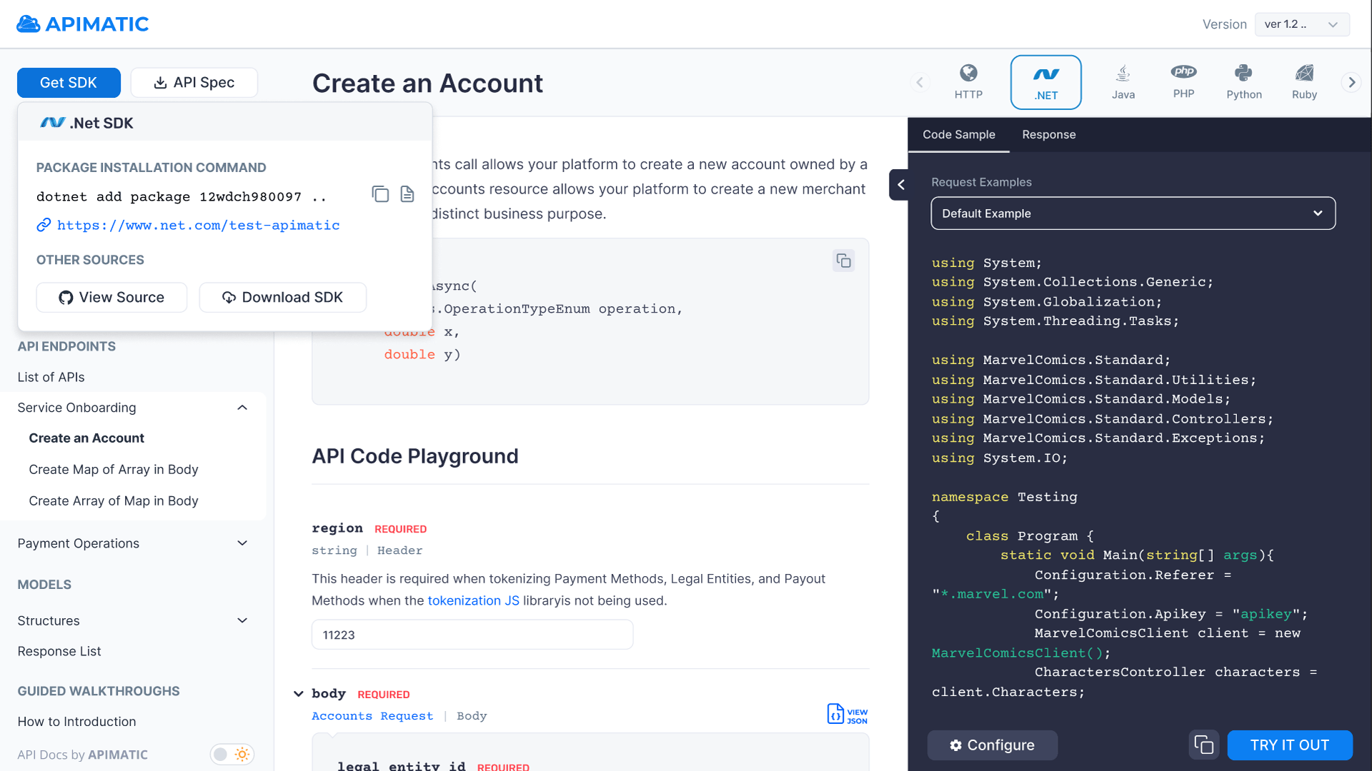
The DX Portal, or Developer Experience Portal, is a comprehensive, no-code platform designed to elevate developer experiences. It encompasses language-specific API documentation, dynamic code samples, live authenticated API calls in a real-time API playground, downloadable SDKs in all languages, and more. The major features I worked on include the Get SDK UI/UX Design, DX Portal Search, New Language Selector, API CoPilot working as SDK AI Chat Bot, and Multiple Authentication. Collaborating closely with the engineering team, I spearheaded efforts to enhance its user experience by minimizing frictions and introducing numerous new features. This involved extensive hours of wireframing, creating mockups, and conducting thorough user testing to ensure optimal functionality and usability.
API Validator
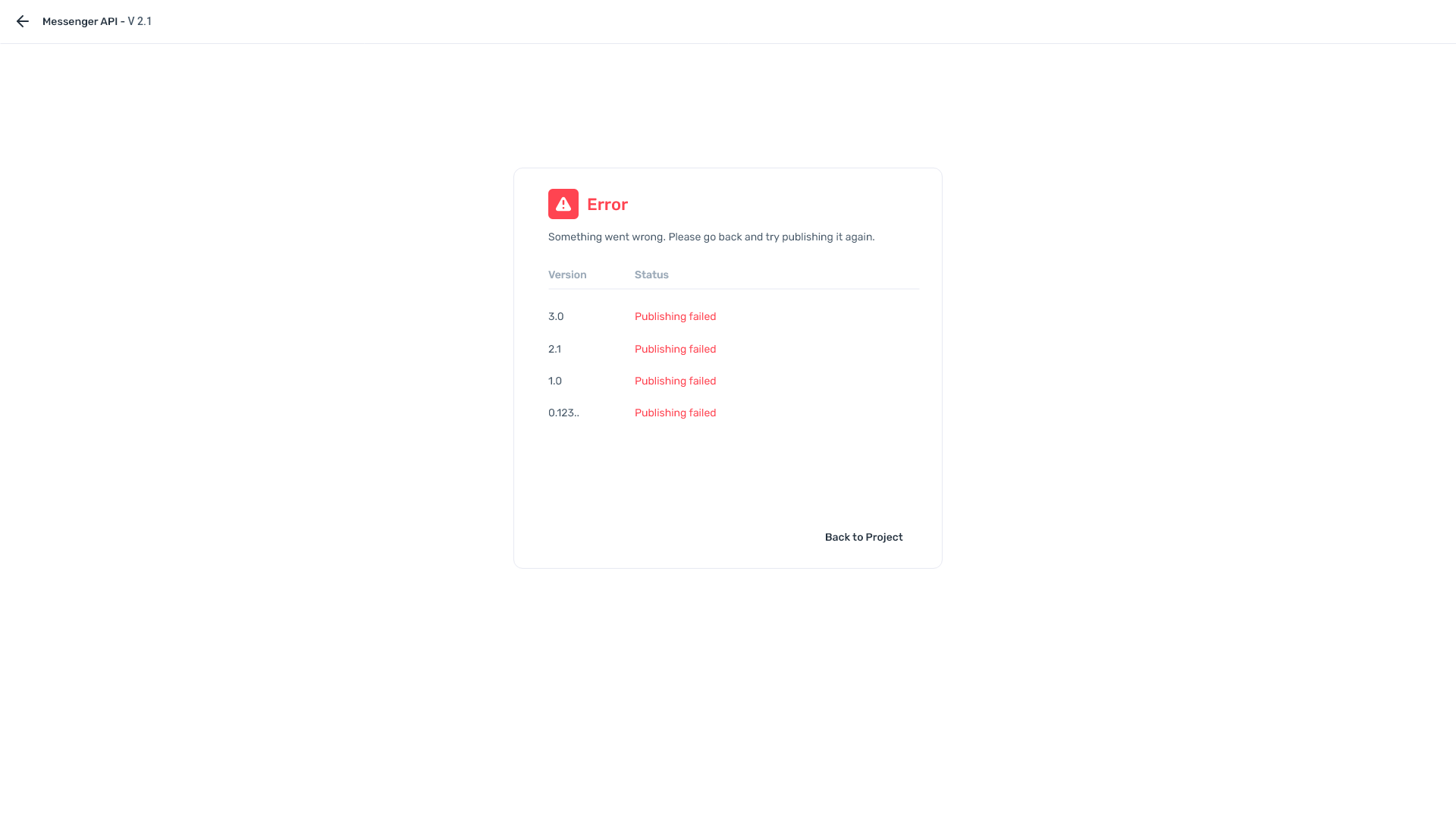
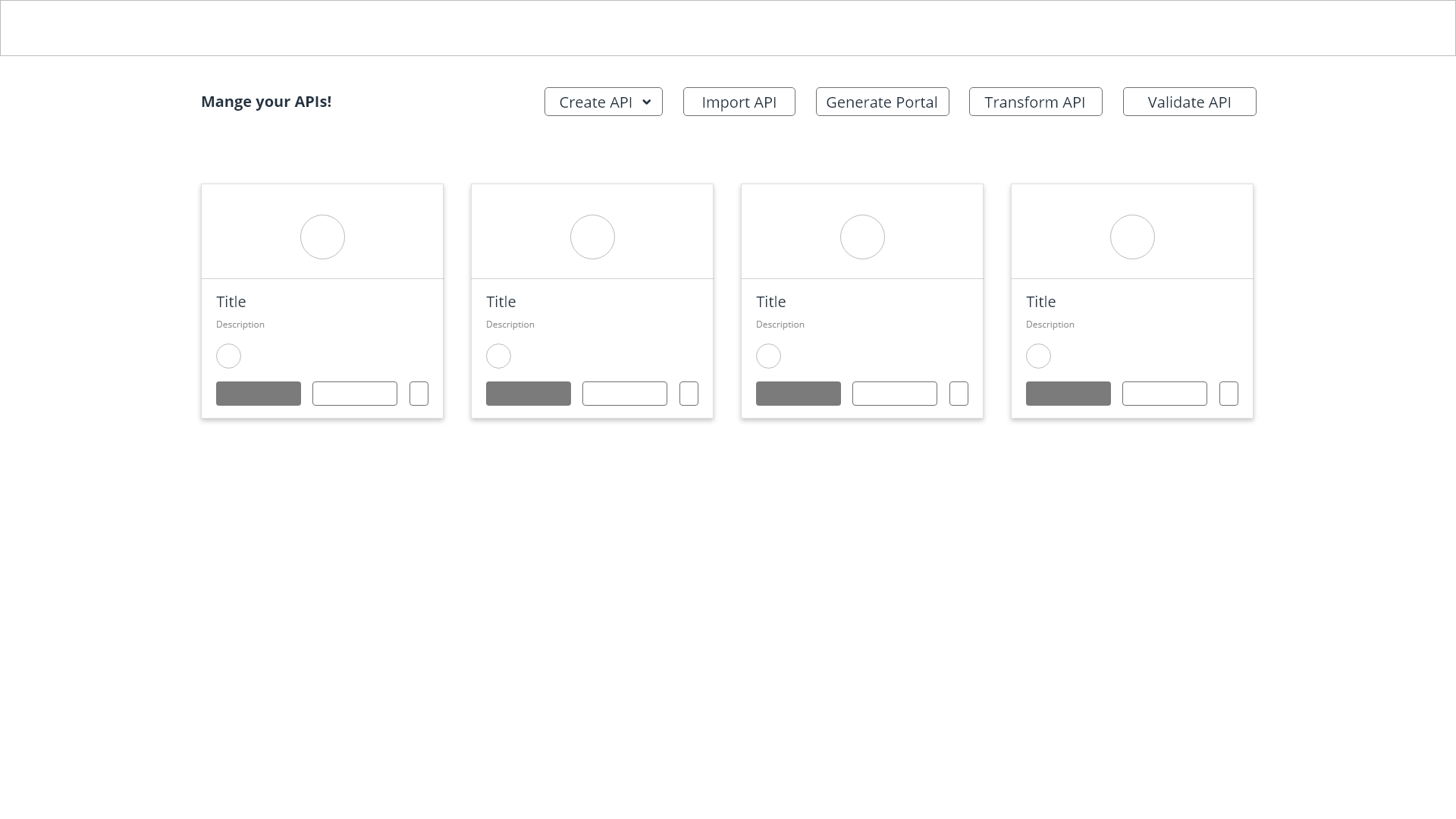
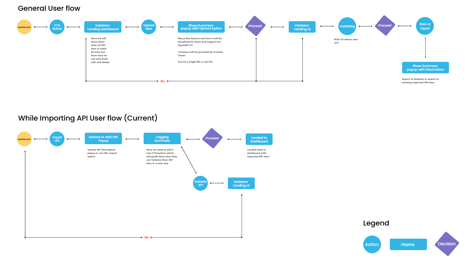
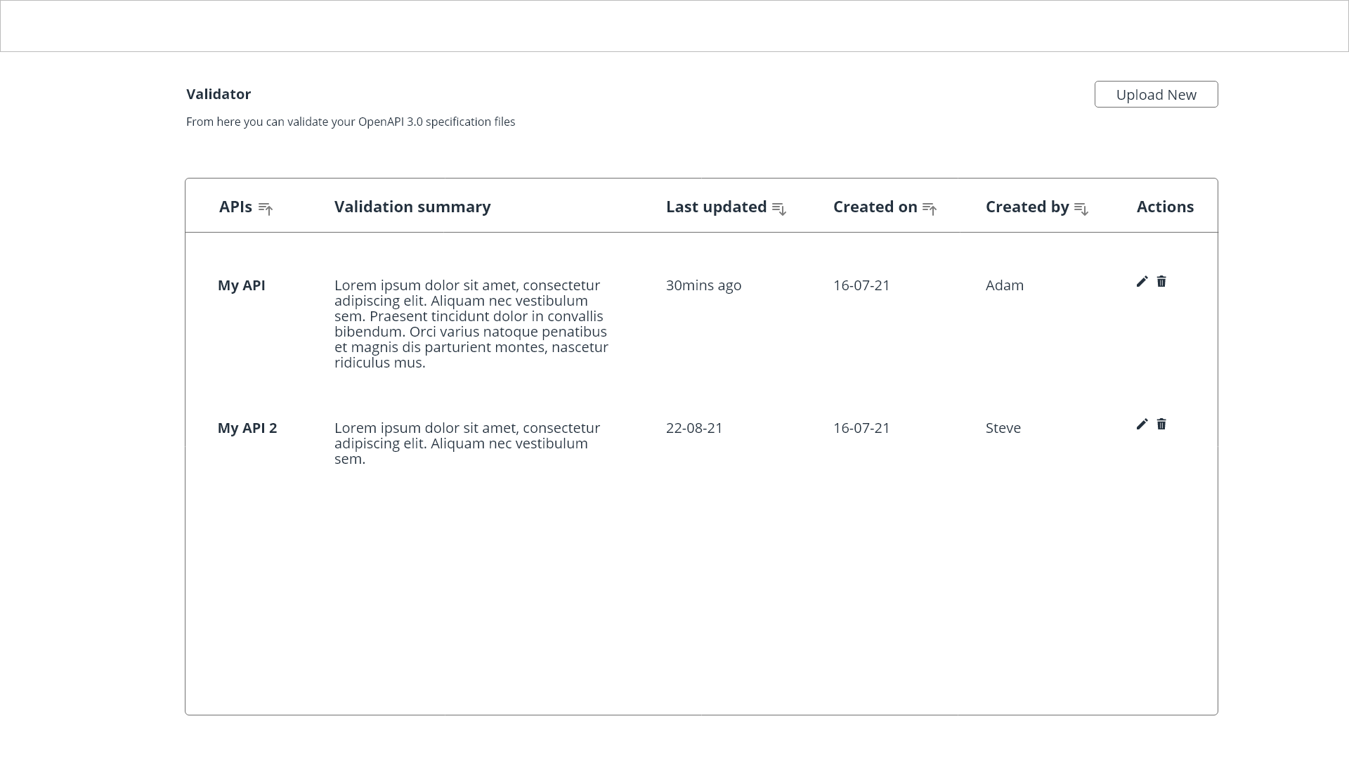
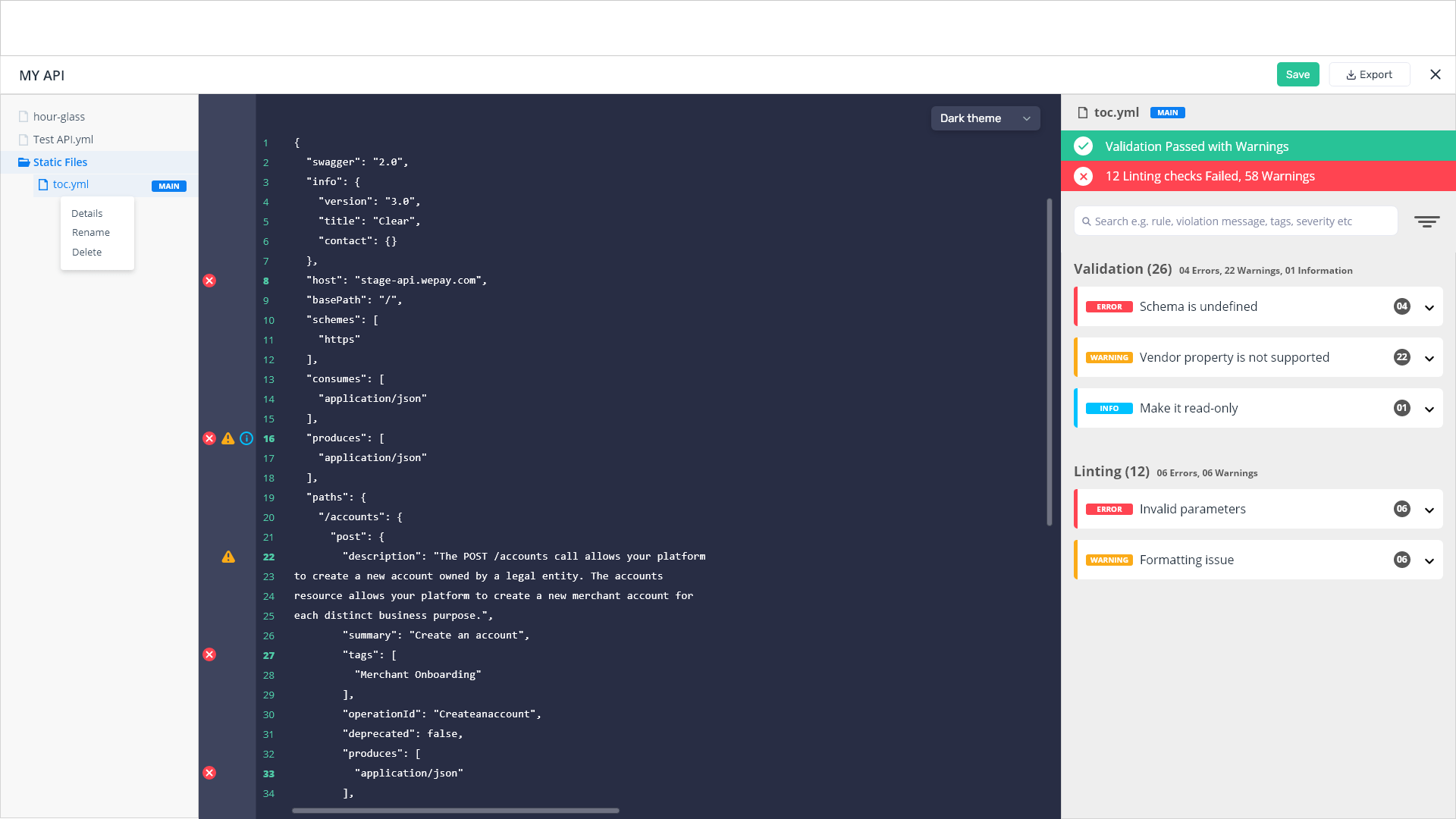
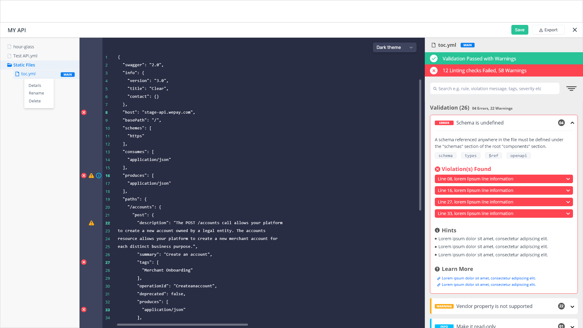
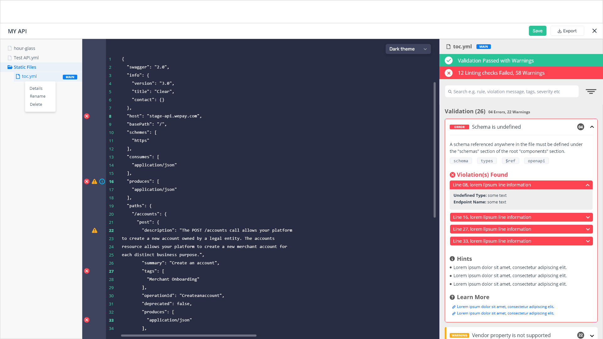
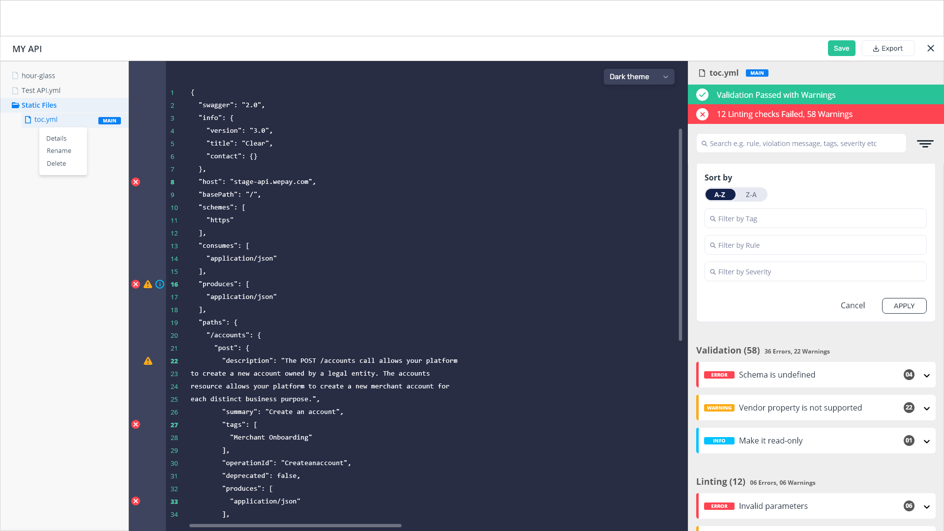
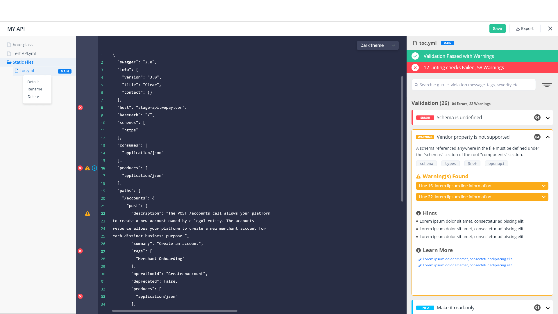
APIMatic tool performs some preliminary checks on the user-provided API specification document to ensure that it meets the basic requirements for generating a valid output during SDK and Portal generation. For that, our transformer team enhanced its capability from basic check to advanced controlled product, in which users can make quick changes in more controlled ways before proceeding. I led its first class concept via wireframes and created mockups with user flows and features.
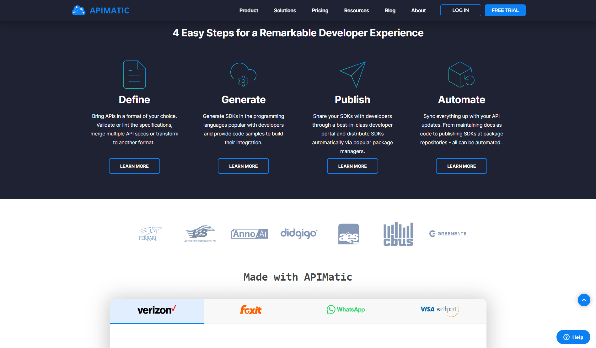
APIMatic's Official Website & Blog
I took charge of our official APIMatic website, originally designed on HubSpot, after its development by a third-party vendor. Following its deployment, I meticulously managed over 500 components, focusing on UI design, CSS adjustments, and JavaScript enhancements. Additionally, I dedicated efforts to optimizing its SEO performance using Google Analytics, Google Search Console, and ahrefs tools.
Other Projects

School Management System Integrated with Microsoft Teams
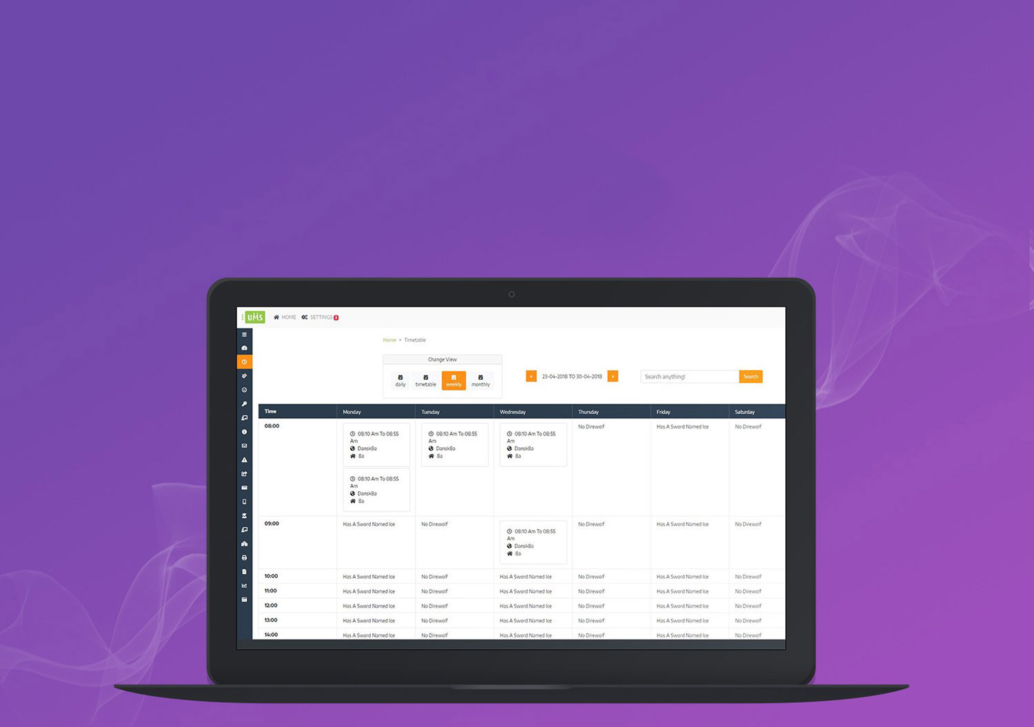
I worked on a complete UI/UX design project, including markup writing, for a client from Denmark. The client had shared specific pain points they were experiencing with their current, limited system. Given that the scope and requirements were clear and straightforward, I directly began development in markup using Bootstrap, ensuring a smooth and efficient design process.
School Management System Redesigned Portal
Complete UI/UX with markup designed for a client from Denmark. Client wanted to upgrade their exisiting portal to new framework and wanted to integrate new components so I designed it using Bootstrap.

Educational Marketing Website
Complete UI/UX with markup designed for Educational Marketing Website

Educational Admin Portal
Complete UI/UX with markup designed for a client from Denmark. Client's requirement and scope was clear and well-defined so I wrote its markup using Bootstrap framework.

Educational Client Portal
Complete UI/UX with markup designed for a client from Denmark. Client's requirement and scope was clear and defined so I wrote its markup using Bootstrap framework.

Educational Marketing Website
Complete UI/UX design with markup for a educational client from Denmark. Client wanted a fresh design of their marketing website so I wrote its markup by using Bootstrap framework.
Knot Game Project (Android & iOS)
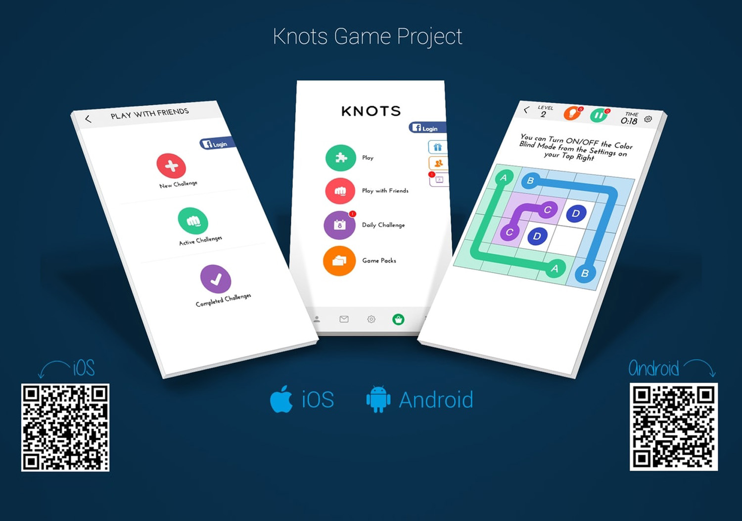
I entirely designed all the assets by using Photoshop for the game components. Client wanted a new and fresh look of the game.
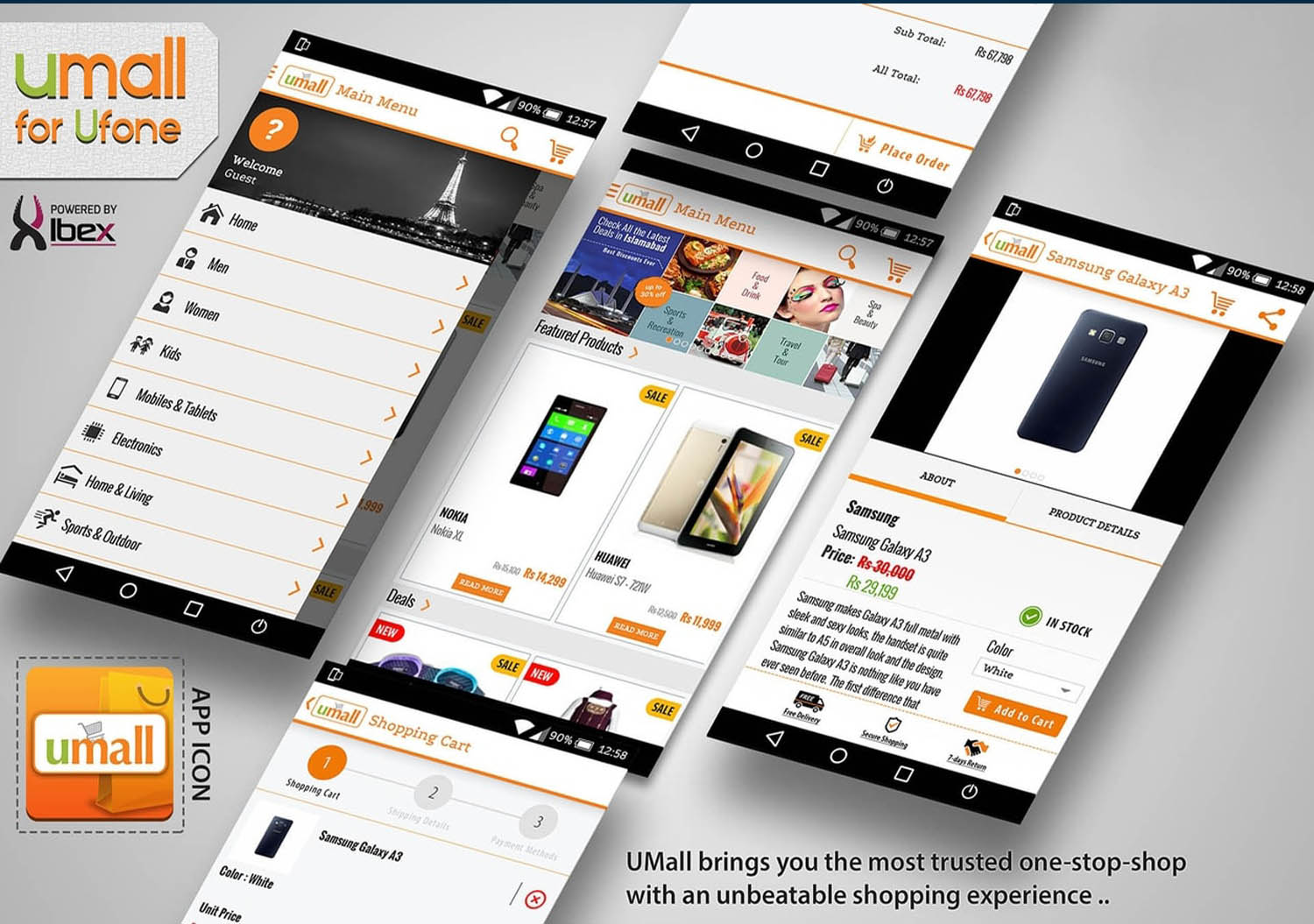
Umall App (Android) for Ufone - 2015
UI/UX app design for Ufone Pakistan. Client wanted a simple shopping app for their customers so I designed it by using Photoshop because exporting assets for app were required as well.
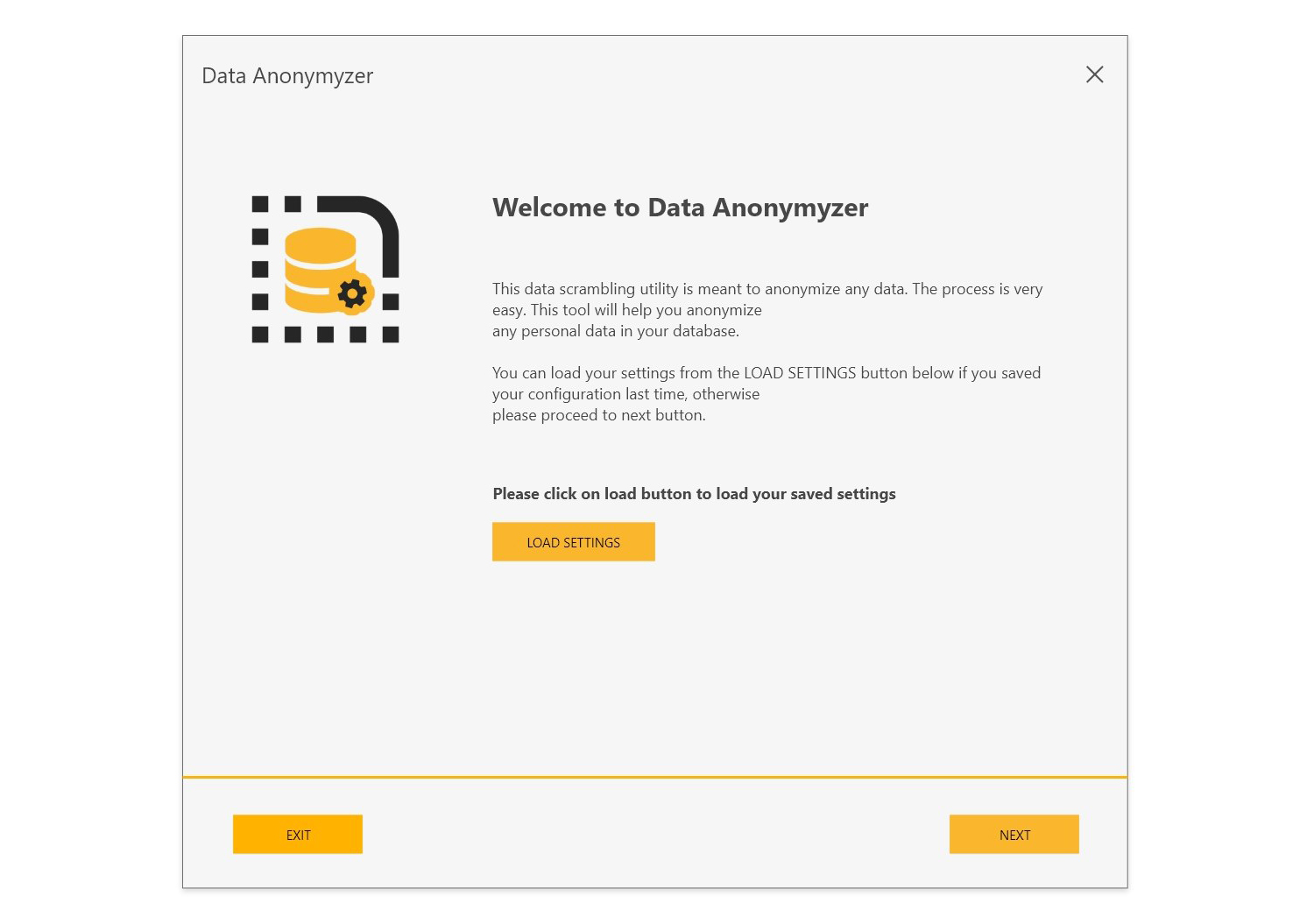
Data Anonymyzer
Data anonymyzer app which anonymyze exisitng data according to GDPR policy. I was responsible for UI/UX design at Synergy-IT.
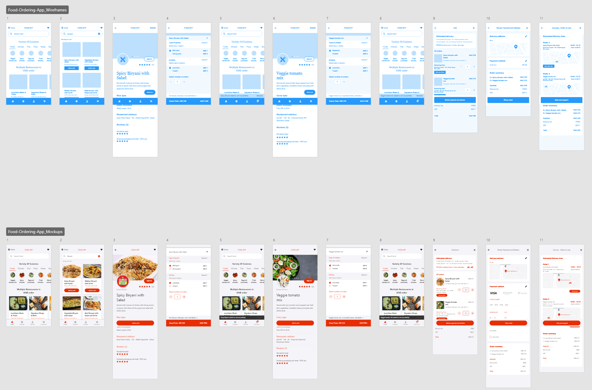
Food Delivery App for UAE Client (Android & iOS)
Designed a food delivery app where users can place orders from multiple restaurants in a single transaction.
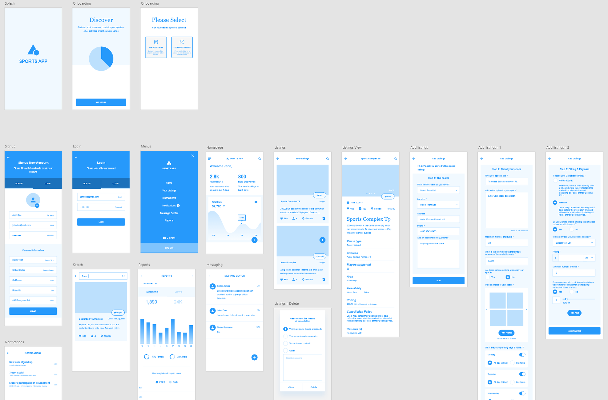
Sports Venue Finder & Booking App for a Saudi Client
The app designed to enable users to book, pay, cancel and share (pooling) the rented venues with each other.
